
Leader Icon
Moderators: Slitherine Core, The Lordz, Panzer Corps Design, Panzer Corps Moderators

Leader Icon
Hi, I have been playing the game extensively and the only thing I miss is a small icon on the unit icon that informs me if the unit has a leader, similar to PG2. I don´t know if this has been asked before but it really would help.

It is already in the game, medal and hero icons are displaced on the unit icons when you toggle the Unit List on the main UI or use the F6 hotkey.
Tim van der Moer - CEO The Lordz Games Studio

http://www.thelordzgamesstudio.com
http://www.panzer-corps.com
http://www.commander-games.com
http://www.thelordzgamesstudio.com
http://www.panzer-corps.com
http://www.commander-games.com
Yes I know it is in the unit list. But I was thinking more like PG2 where the icon got a portrait of a leader in the lower right corner. That way you knew the unit was valuable at a glance and could better implement strategy on the map. Wouldn´t have to be fancy, just a small icon within a icon. Then I could alt-click or look at the unit list to see what bonuses the unit had. Maybe I´m nitpicking but this is the only thing I find is missing in a otherwise excellent game.

The problem is that the amount of information on the map for each unit is already quite extensive.

Can move, can shoot, city flag, strength plate, fuel condition, ammo condition.
However I do completely agree that leader representation needs to be included in that image, but it's a question of 'where' and will it looks good?
This is an early BETA example that may be a nice solution. Notice the 109 with the colored nose, or the tanks with little commanders poking out of them.
(Can you believe the game used to look like this, you new guys are so spoiled!)
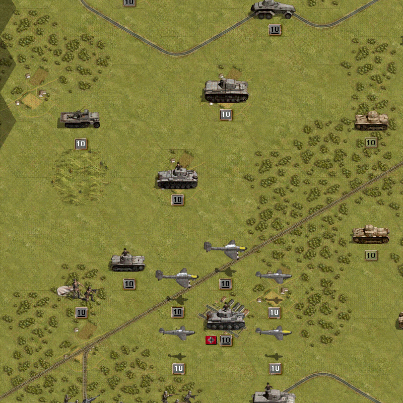
As seen in
viewtopic.php?t=22108&postdays=0&postorder=asc&start=0
Can move, can shoot, city flag, strength plate, fuel condition, ammo condition.
However I do completely agree that leader representation needs to be included in that image, but it's a question of 'where' and will it looks good?
This is an early BETA example that may be a nice solution. Notice the 109 with the colored nose, or the tanks with little commanders poking out of them.
(Can you believe the game used to look like this, you new guys are so spoiled!)
As seen in
viewtopic.php?t=22108&postdays=0&postorder=asc&start=0

Fully agree.palli99 wrote:Yes I know it is in the unit list. But I was thinking more like PG2 where the icon got a portrait of a leader in the lower right corner. That way you knew the unit was valuable at a glance and could better implement strategy on the map. Wouldn´t have to be fancy, just a small icon within a icon. Then I could alt-click or look at the unit list to see what bonuses the unit had. Maybe I´m nitpicking but this is the only thing I find is missing in a otherwise excellent game.
Only a minor feature but still kinda "must have feature".
Theres room to the left of the strenght indicator.Kerensky wrote:The problem is that the amount of information on the map for each unit is already quite extensive.
A Balkenkreuz for Axis and a Star for Allies would be nice,u know just like PG2 had it.
It will overlap a bit with the flag when a unit is in a city but i wouldn't mind as long it doesen't cover more than 40% of the flag.
I don't realy like this way.Those commanders looking out of the tank will be hard to see in forrests and such.Kerensky wrote:This is an early BETA example that may be a nice solution. Notice the 109 with the colored nose, or the tanks with little commanders poking out of them.
(Can you believe the game used to look like this, you new guys are so spoiled!)
Infantry is already hard to see in forests when unitglow is turned off.
And with unitglow on things look kinda unatural and ...not good.
2cents
-
El_Condoro
- Panzer Corps Moderator

- Posts: 2119
- Joined: Tue Jun 03, 2008 9:32 am
What about a border around the nation flag? Just a couple or few pixels wide and of a colour that stands out from all the terrain features that might be behind. White, yellow...
PG2 had the leader indicator but it didn't have the ammo/fuel indicator (you had to right-click for those), so space is a premium and it needs to avoid 'busy-ness'.
Razz's idea below is even better IMO. All the relevant unit information, especially range which is missing now, could be there along with the leader info. That bottom right corner is under-utilised.
Last edited by El_Condoro on Mon Jul 04, 2011 2:13 am, edited 2 times in total.
I think the unit information panel should automatically pop up every time you click on a unit.
It should appear on the right bottom menu.
Plenty of space there.
Get rid of all this, alt click stuff.
Then, below this we can see the leader menu.
Plenty of room there.
No room? Get rid of strategic map. Use hot key for it to come up.
It should appear on the right bottom menu.
Plenty of space there.
Get rid of all this, alt click stuff.
Then, below this we can see the leader menu.
Plenty of room there.
No room? Get rid of strategic map. Use hot key for it to come up.