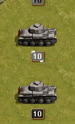
Fired & Moved state visualisation

Open beta forum.

Moderators: Slitherine Core, The Lordz, Panzer Corps Moderators, Panzer Corps Design

adherbal
The Artistocrats
The Artistocrats
Posts: 3900
Joined: Fri Jun 24, 2005 6:42 pm
Location: Belgium

Fired & Moved state visualisation

Post by adherbal »

Possible way to show fired & moved state. Thoughts?

Image
Fired

Image
Moved

Image
Fired & Moved
boredatwork
Staff Sergeant - Kavallerie
Posts: 314
Joined: Sat Jan 15, 2011 5:39 pm

Post by boredatwork »

I like it, but would it work for guns, infantry & aircraft?
Kerensky
Content Designer
Content Designer
Posts: 8624
Joined: Wed Jan 12, 2011 2:12 am

Post by Kerensky »

Looking at those pictures, I feel very conflicted.

Pros:
It's very artful and makes the unit feel much more alive on the board.
It's a unique approach, at least to me it is.

Cons:
The battlefield is going to be an incredibly dusty place at the end of your turn.
What about Infantry, or Halftracks without protruding barrels, or aircraft?
It also seems slightly counter-intuitive. The unit that is fully ready for action appears the simplest, with no visual indicators. Units gain indicators as they spend movement and spend their shots. So instead of having a currency to spend that is removed (icons/symbols that disappear), units are gaining visual indicators when they are using up their actions.

Upon further reflection, I could almost forgive the fact that units are stagnant in facing left or right if these visuals were animated and appeared as units performed their actions. In this case, it would make sense to use this type of visualization. You let the player see their units moving, and guns firing, then the impression of smoke and dust immediately becomes associated with 'action complete'.
IainMcNeil
Site Admin
Site Admin
Posts: 13558
Joined: Fri Apr 01, 2005 10:19 am

Post by IainMcNeil »

I think it looks good but agree its not going to make units that have not moved stand out. I also share the concerns for other types of units such as infantry & air units. We also would require a lot of extra art time to create all these new variations.

If we like the approach I would suggest that units that have moved and fired are drawn with neither effect but are darkened to show they are inactive.

Units that have neither moved or fired could also have their strength indicator blink to show they are active.


An alternative system
* Units that ahve not moved or fired have their strength marker blink on/off
* Units that have moved & fired are darkened.
* Units that have moved or fired but not both are drawn as now, no darkening or blinking. It means you cant tell the difference between a unit that has only moved and one that has only fired. If we decide we really need to differnetiate the two we could have one blink the number without the strength box and the other blink the border of the strength box, or maybe have teh border switch between 2 colours and choose different colours for differetn states. The effect needs to be subtle.

I think we would also want a way to put units in to sleep mode so they are permanently non blinking until you move them or a way to say for the rest of the turn you're done with this unit - e.g. the space bar. Presing space would only stop the blinking rather than actyually prevent you moving.firing teh unit.
Rudankort
FlashBack Games
FlashBack Games
Posts: 3836
Joined: Sat Aug 21, 2010 2:23 pm
Contact:

Post by Rudankort »

iainmcneil wrote: I think we would also want a way to put units in to sleep mode so they are permanently non blinking until you move them or a way to say for the rest of the turn you're done with this unit - e.g. the space bar. Presing space would only stop the blinking rather than actyually prevent you moving.firing teh unit.
This feature already exists - "sleep" command. It is tied to Z hotkey at the moment, but we can reassign it to space.

In the beginning I thought that it was enough to indicate if a unit has any action left (do not differentiate moved and fired) but from my experience with the game I can tell that we need to indicate these separately. Veyr often I see an artillery on the battlefield which still can move (it is typical to fire with arty first and move it later), and I have no idea if it can still fire or not. To figure out, I often need to select it and move it somewhere because it may not have enemies in range until you move it. This is of course very inconvenient. With other units this situation also happens quite often: you move a unit next to an enemy, find that it cannot attack any more, and undo the move back. A lot of routine unnecessary actions which could be avoided with some simple indicator on the unit.
adherbal
The Artistocrats
The Artistocrats
Posts: 3900
Joined: Fri Jun 24, 2005 6:42 pm
Location: Belgium

Post by adherbal »

New attempt:

Icons will display if a unit runs low (yellow) or very low (red) on ammo or fuel. These states are closely linked with attacking & moving so using the same icons to display whether the unit has moved and/or fired: Opaque icons when the have not moved/fired, transparent icons when they have. If different is not strong enough the opaque state could blink.

Image

Image

Image

Image
IainMcNeil
Site Admin
Site Admin
Posts: 13558
Joined: Fri Apr 01, 2005 10:19 am

Post by IainMcNeil »

I'm really against adding more UI elements if we can avoid it or it just looks cluttered. I would prefer to use existing UI in some way.

E.g. the box the number is in, the border to the box, darkening the unit icon etc.

A blinking strength box for a unit that has not moved or fired. A darkened one for one that both moved & fired. Then all we need is a way to tell if a unit has moved or shot...

I am assuming people do not want to change to a system where you have to complete a units move in a single action, so once you move to the next unit you cannot return to this one? If we could make this change the UI suddenly gets simpler and all we have to show is moved or not moved...
Kerensky
Content Designer
Content Designer
Posts: 8624
Joined: Wed Jan 12, 2011 2:12 am

Post by Kerensky »

This seems like a pretty important topic, so I created several visuals for people to consider.
Images have NOT been resized to get a fuller feeling of how these visuals appear.
For the record, I STRONGLY discourage the idea of pure Panzer General style where units only have 2 states, All Active or None Active. More modern games need the flexibility that 4 states offers, or the pace of game play is far too slow and too punishing.

All youtube videos are set as 'UNLISTED' to comply with the NDA, so it should not be possible to find these videos on youtube without a direct link to access these videos. If you can fish through all my youtube videos and find these videos, please let me know and I'll try listing them as private instead.
What is an unlisted video?

An unlisted video is a different type of private video. Unlisted means that only people who know the link to the video can view it (such as friends or family to whom you send the link). An unlisted video will not appear in any of YouTube's public spaces (such as search results, your channel, or the Browse page).
Also, all videos have 2 speeds.

#1 Smoke and Dust
I immediately noticed this style looks really out of place. If the entire map had smoke, fog, dust, explosions, craters, and so on, this might be workable, but as it is, I don't believe so.
Click here for the full size image
(Edited because having to scroll every new post to read it was getting a bit annoying :wink: - Lukas )

#2 Icons
Surprisingly, it doesn't look that bad to me. It's not too cluttered, but the current difference between opaque and transparent isn't strong enough either. You can tell at a glace a unit's status without having to click on it, but you really have to look closely, and I imagine terrain such as SNOW or SAND, might make this even more difficult. Also, where are the icons for leaders/aces/whatever PzC will have go?
Click here for the full size image
(Edited because having to scroll every new post to read it was getting a bit annoying :wink: - Lukas )

#3 4 States: Blinking Tanks and Blinking Numbers
Solid tank cannot move.
Solid number cannot shoot.
Blinking tank can move.
Blinking number can shoot.

Even with the craptastic photoshop, I don't see how this can be an appealing option. Something as large as the units blinking is just overbearing, especially imagine a screen full of units blinking? People are going to complain about having seizures. Perhaps normally colored units for CAN MOVE, darkened for CANT move, blinking for CANT SHOOT, solid number for CANT SHOOT would work, but I just can't bring myself to appreciate darkened units states.
http://www.youtube.com/watch?v=BCnLIaPT9TE

#4 Blinking numbers with Icons
A marriage between #2 and #3.
This video really makes me think blinking numbers is a great way to go, it's obvious but not overbearing. However it does completely overshadow the static icons on the side.
http://www.youtube.com/watch?v=SrUZx3MDX6s

#5 Blinking number with Swirling Border
After seeing how great blinking number worked, and how iainmcneil stated he wanted to use current UI elements instead of adding more, I came up with this idea. It has the added benefit of being intuitive. A graphic that is in motion tells you that your unit can move.
I did a fairly quick job of the visual, but if the color was improved and the motion was made to be fluid, I really like this option.
http://www.youtube.com/watch?v=mf8DBBSfoRs
Imagine if that swirling blue outline looked something more akin to:
http://www.youtube.com/watch?v=GS8ru8PaDO4

So
CAN FIRE is blinking number
CANNOT FIRE is solid number
CAN MOVE is swirling outline
CANNOT MOVE is solid outline
boredatwork
Staff Sergeant - Kavallerie
Posts: 314
Joined: Sat Jan 15, 2011 5:39 pm

Post by boredatwork »

CAN FIRE is blinking number
CANNOT FIRE is solid number
CAN MOVE is swirling outline
CANNOT MOVE is solid outline

I really like your idea of the Warcraft auto cast swirl but I think the blinky number is too strong. Plus, at least as illustrated in your example with the number itself flashing distinguishing between core and aux units could be a challenge.

I would suggest either a blinking pixel like PG/PGF or a darkening in strength number background.

Also IMO I think the swirl would make more sense for firing and the blinking/colour change for movement for the relatively arbitrary reason that the swirl looks cooler and it makes sense to attach the more mundane indicator to the more mundane function of movement.

Image


PS - what version of Photoshop are you using?
IainMcNeil
Site Admin
Site Admin
Posts: 13558
Joined: Fri Apr 01, 2005 10:19 am

Post by IainMcNeil »

Thanks guys - very impressive stuff :)

We need to think about what is going to look best and be clearest.

Another option
* Moved units are darkened
* Units that have not fired have a swirling border

Using these 2 clues we cover all 4 states.
Rudankort
FlashBack Games
FlashBack Games
Posts: 3836
Joined: Sat Aug 21, 2010 2:23 pm
Contact:

Post by Rudankort »

Great stuff indeed, very useful. For the record, I'm not particularly fond of animations for moved/fired indication. Animations are useful to attract user's attention to something, but when you see the screenful of your initial deployment blinking and swirling, it will look like a mess without giving us any real advantages in return.

We have two distinctive goals to achieve in the UI:
1. Show the player if he has any unmoved units left, and if yes, where they are
2. Show the player what he can do with a unit he is looking at

I think that there is no point in trying to solve goal 1 on the tac map - it is too small and shows only a little portion of the map at any given time. So, if you see that all units on the tac map have moved, it does not mean anything - there may be other units outside the map borders. This is where the minimap comes in handy, and this is where animation will do the job very well. If we mark unmoved units with blinking dots on the minimap, while all the rest will be static, the player will be able to tell if he still needs to move anything by quickly glancing at the minimap, where blinking dots will attract his attention.

On the other hand, goal 2 must be solved on the tac map and nowhere else. When I'm planning tactics, I should be able to see if a unit has any actions left, and which exactly, by just looking at it. There is no need to attract my attention - I'm already looking at the unit - and so there is no need to use animations and turn the tac map into moving mess at the beginning of the turn.

Also, if we animate "fired" and don't animate "moved", the former units will stand out, while filtering out the latter will be harder for the eye. But when you plan tactics, you should see both cases clearly enough.
IainMcNeil
Site Admin
Site Admin
Posts: 13558
Joined: Fri Apr 01, 2005 10:19 am

Post by IainMcNeil »

I think if the pulsing is subtle enough it can work. We have used it before in other games and it works well. It can be subtle enough so it is not annoying but it does attract attention easily.

Using the minimap idea we could do this as another option

* Moved and fired - darkened
* Moved or fired but not both drawn as they are now
* Neither moved or fired, as now except that the strength pulses or there is some other subtle animation to show the unit has done nothing.

Combined with this the minimap pulses the dots of units that are available to move/fire. There would be a 4 phase pulse.
* Phase 1 pulse any units that have not moved - light blue, all others dark blue
* Phase 2 pulse all dots dark blue
* Phase 3 Pulse all units that have not fired - mid blue, all others dark blue
* Phase 4 pulse all dots dark blue

The issue with using the minimap is that you can never match it up exactly with what is on screen so it is not my preferred option as it is definitely not as functional. E.g. If I have 10 units on screen, working out which of them is the pulsing dot is extremely hard and would be very frustrating in my opinion.
Rudankort
FlashBack Games
FlashBack Games
Posts: 3836
Joined: Sat Aug 21, 2010 2:23 pm
Contact:

Post by Rudankort »

My point was that the animations on the tac map are not needed in the first place, they do not serve any specific purpose here. By making animations more subtle, you reduce negative effects of them, but they do not obtain any more usefulness. ;)

My thoughts on the problem:
- The more I think about this, the more I'm convinved that we should use two separate indication schemes.
1. Does the unit have any actions left? (yes or no). Units with no actions left are excluded from any tactical planning, so they should stand out very clearly. This indication should be tied to unit icon, because only then we can make it work for both big and small units (in case two units share the same hex). Darkening the unit has its problems, but it is the best option I see for now.
2. If the unit has any actions left, which exactly? We must explicitly indicate "moved" and "attacked" separately, I have explained why this is important above in this thread. So, we need two small indicators: one for moved and one for attacked. These indicators should be tied to strength label to stress the fact that they are related to the unit in the current plane (ground or air), i. e. to the same unit where strength label itself belongs.

- Using space to the right of strength label breaks the symmetry, and so probably will not work very well. Indicators should be placed inside the strength plate, or above it (we have some space there).

- Indicators should stand out very well, otherwise they will be hard to see ane use. On the other hand, they should not spoil the overall appearance of the tac map. How to satisfy these two conflicting requirements? I think, the answer is, the indicators should be used as little as possible, only when they are strictly necessary. Then there will be few of them on the map, and they will not create clutter. But when needed they will attract player's attention.

- So, when indicators are not needed?
1. When a unit has both fired and moved actions available. In this case indicators are redundant and we don't show them.
2. When a unit has actions left, but cannot use them. For example, a unit has moved, but still has an attack action. But there are no enemies in range, so attack action is useless. We do not indicate it.
With this scheme in place, the player will see indicators only on units which he already used in some way, but which still can do something useful. Such units are few, and very often it is useful to attract player's attention to them.

So, to sum it up, we could try a scheme like this:
- Unit can move and fire - same as now
- Unit can move - same as now+a small green dot or some suitable icon appears above its strength label
- Unit can fire - same as now+a small red dot or some suitqable icon like crosshair appears above its strength label
- Unit cannot do anything - icon is darkened, no indicators. Used for both big and small icons.
- In addition to this, but not instead of this, we can also make pulsing/animated strength labels for unmoved units, to make Iain happy. :)
Rudankort
FlashBack Games
FlashBack Games
Posts: 3836
Joined: Sat Aug 21, 2010 2:23 pm
Contact:

Post by Rudankort »

An example from tutorial scen 3:

Image

I have moved 3 infy units next to enemy city (to generate mass attack effect), and then attacked with the middle unit. Result:
- the infy I attacked with is darkened to indicate I cannot use it any more on this turn
- Two other infys have got a red dot above their strength labels. These dots attract my attention and remind that these units should still be used even though I've already controlled them
- Other units look the same as now, these are units I haven't done anything with yet. They have no indicators attached to them, so there is no visual clutter of color dots on the screen.
Rudankort
FlashBack Games
FlashBack Games
Posts: 3836
Joined: Sat Aug 21, 2010 2:23 pm
Contact:

Post by Rudankort »

I have forgotten one more special case: sleeping units. These have actions, but the player explicitly said he's done with them. For these units we can use an additional indication: unit icon is not darkened, but, for example, strength label is grayed out to show that unit is "inactive".

If the user does not use Sleep command, but the units cannot do anything useful (e. g. has fire action, but there are no enemies nearby), I suggest to apply Sleep command to it automatically to make sure it differs from unmoved units on the tac map, and that it is not selected as part of the "next unit" sequence.
adherbal
The Artistocrats
The Artistocrats
Posts: 3900
Joined: Fri Jun 24, 2005 6:42 pm
Location: Belgium

Post by adherbal »

Actualy showing it as an additional icon or in the strength plate makes no sense, because you can have both an air and ground unit on the same tile. One of both is gonna be small, so you won't see the state of that unit without switching the annoying ( :wink: ) air/ground mode.

How about a unit icon glow effect. White for all actions available, red for attack action available, green for move action available. Works for both small and bit icons, and additionally helps available units stand out on any terrain type.

Image

Image

Image
Rudankort
FlashBack Games
FlashBack Games
Posts: 3836
Joined: Sat Aug 21, 2010 2:23 pm
Contact:

Post by Rudankort »

adherbal wrote:Actualy showing it as an additional icon or in the strength plate makes no sense, because you can have both an air and ground unit on the same tile. One of both is gonna be small, so you won't see the state of that unit without switching the annoying ( :wink: ) air/ground mode.
On the contrary, you cannot really decide what to do with a unit if you don't see its strength, so within our UI model tying this information to strength label is justified. If we showed strength for big and small units at the same time, I would agree with your objection. ;)

But using glow effect for active units, instead of darkening inactive ones might work very well.
adherbal
The Artistocrats
The Artistocrats
Posts: 3900
Joined: Fri Jun 24, 2005 6:42 pm
Location: Belgium

Post by adherbal »

On the contrary, you cannot really decide what to do with a unit if you don't see its strength
Isn't the whole point of highlighting available units whether you still need to "decide what to do with them" :) If they're not highlighted you've already made all it's moves and there's no reason to go back to it in the current turn. You look at whether they can still do something and THEN look at strength, not the other way round.
IainMcNeil
Site Admin
Site Admin
Posts: 13558
Joined: Fri Apr 01, 2005 10:19 am

Post by IainMcNeil »

Lukas I think those effects look pretty ugly so would be against them being on all the time.

Alex I disgree on the pulsing. It can work and look fine and has been used before and proven to look good and do the job. You want your eye to be drawn to things in this priority. We have a flat 2D game and anythign that adds a bit of movement to the screen is going to really help it not look dull compred to the more glamourous games out there. I still think the rotating sparkle effect looks really nice and adds a level of polish to the game. Maybe we have it as an option but to more causal players this is going to be a nice effect. We can always allow hardcore players to turn it off.
* Units that have done nothing
* Units that have done something but have remaining actions
* Units that are done

This means that the one that should stand out most is units that have done nothing. This is why the subtle pulsing works here for me personally.

Ok another suggestion :)

We only show 3 states Remaining actions or no remaining actions.

* If a unit has done nothing it pulses in some way to draw your eye to it. Effect TBD.
* If a unit cannot do anything it goes dark. This includes units that have moved but not fired if there are no enemy units in range. Note this would have to be updated after every combat as units could be forced to retire in to range of a unit that had already moved.
* Units that have more or fired but not both are drawn normally.

There would be a hot key and UI button to flash info on about what actions a unit has remaining. We can use any of the proposed ideas such as icons, glow around the units - whatever. The key press would just give a short flash or series of flashes to draw your attention to the units of interest.

Alterntively this could be a permanent toggle so the effect lasts until you press the key or UI button again
Rudankort
FlashBack Games
FlashBack Games
Posts: 3836
Joined: Sat Aug 21, 2010 2:23 pm
Contact:

Post by Rudankort »

adherbal wrote:Isn't the whole point of highlighting available units whether you still need to "decide what to do with them" :) If they're not highlighted you've already made all it's moves and there's no reason to go back to it in the current turn. You look at whether they can still do something and THEN look at strength, not the other way round.
Absolutely, and that was the whole point of my proposal. First, you clearly differentiate units which can do something, and which cannot, and you do this for all units (big and small alike). Second, in the first group you differentiate units by what exactly they can do, and this is done for big units only. You can of course indicate it for small units too, but this is more difficult to do and will not give you any real advantages, because tactical planning implies looking at the right plane. I think, using a two-level scheme is justified, because most units are always in either "move+attack" or "none" states. Single action states are exceptions really, so it seems like the right idea to use some separate scheme for them, not try to integrate everything into a single scheme.

The approach you have proposed will work, but it has all the standard disadvantages of color codes: if they are subtle, they are hard to distinguish (thus, on my monitor white and green glow very similar), and if they are strong, they will effect the appearance of the map in a negative way. Besides, in my proposal you can use icons which will be immediately clear (e. g. arrow for movement, crosshair for attack), and color codes are not self-explaining.
Post Reply

Return to “Panzer Corps Open Beta”