After I championed swirls at first, I'm a little conflicted about them. For example, how is the swirling showing the 4 different states of a unit? You either have to add another indicator to the unit, or you have to separate elements of the swirl (changing the number color which may not be an option, as that might be used for strength indication as adherbal showcased), or underlining the number, which in my opinion is painfully weak in contrast to even the slower/weaker swirl. For another possible example, see #1 sample in my previous post.
However I strongly disagree that the swirls could be randomized. That really would be too chaotic.
EDIT:
Sorry, I hate being at the bottom of pages in forums.
Wow this thread exploded. Damn my being ~10 time zones away from the majority of you.
I have a few brief points to weigh in on, then I'll make some more samples out of the new additions I see here.
When I was catching up in this thread, I was quickly glancing over images people made, and I realized I was treating the forum like I was treating the game. I was stealing quick glances at images and trying to determine what the status of units was and how much my attention was being drawn by the various effects illustrated here.
Disclaimer: these are just my personal opinions, I mean no offense to anyone.
Agreed. If unit glowing is ugly, than surely making them dark and low contrast isn't an option either?
Also agreed. As before, I can't bring myself to appreciate darkened unit states (actual tank image not the number) and I feel similarly about auras, whether they are constant or pulsing. No offense to anyone intended, but I found that images I glanced at quickly that contained darkened units just struck me as little more than "dark grey blobs", as bored put it. Excellent for representing unit action completion, but not aesthetically pleasing.
Auras suffered from a similar problem, except they completely lose that excellent unit state representation to gain very small aesthetic appeal.
I'm convinced by glancing at these pictures just like I would be glancing at the game itself, that the answer lies in blinking animation. In other words, this:
* If a unit has done nothing it pulses in some way to draw your eye to it. Effect TBD.
However, I disagree with:
* If a unit cannot do anything it goes dark. This includes units that have moved but not fired if there are no enemy units in range.
I feel that

is satisfactory. Active has an active indicator, not necessarily that specific indicator, but an indicator never-the-less. Inactive have an inactive indicator. Very intuitive.
Making a unit 'go dark', in addition to my personal opinion of being ugly, adds the problem of 'I gain a visual attribute when I expend my actions' which I believe is counter intuitive. You spend action, you lose something you have: you spend a 'currency'. You gain actions, you receive currency to spend. Units are not gaining their inactive state, they are spending their active ones. Does that make sense?
And with:
* Units that have more or fired but not both are drawn normally.
I'm conflicted. As long as you mean they(a unit who has moved but can fire versus a unit who cannot move but can fire) do
not look identical, I agree.
But for the last case we must find a suitable visual indication of what action exactly is there, and by default this indication must be on. Having an option to switch it off is fine, but it should be good enough so that we are not ashamed to have it on by default, so that most players benefit from it out of the box.
Complete agreement. It's obvious that there is no single perfect method to represent unit states, or every single person would agree to it and every single game of the genre would use it. The only thing that can be done is to find the 'best fit' but leaving the option for the (hopefully) minority who don't happen to like it is the best answer.
As for animation effects, swirling animation may look nice, but it is way too strong to use on many units at once. I would vote for pulsing, or maybe something like a quick running speck of light across the strength label (like used on diamonds in various casual games).
With the above quote in mind, I was considering some of the following options:
#1
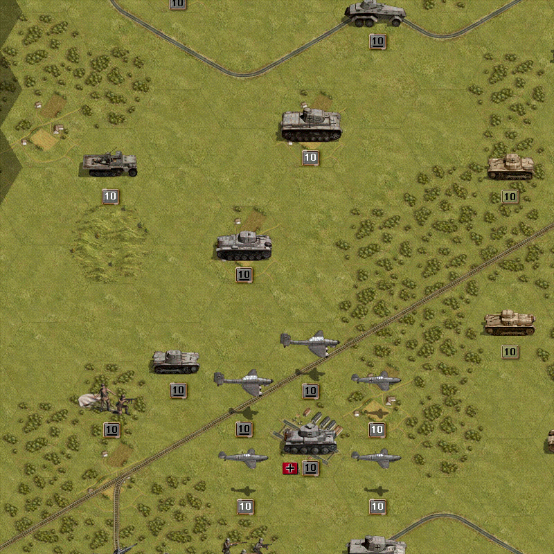
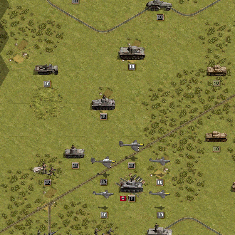
Take this image, what do we have?
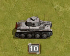
Two objects orbiting the border. Hmm... two objects? What if one object was associated with 'fire' and the other is associated with 'movement'?
Pretend the color tinted object is associated with firing and the solid white is associated with movement.
A unit that can move and fire looks like:

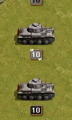
After that unit fires, it looks like:

After it moves and fires, there are no orbiting animations, for example the black background tank directly below.
#2
Take this image, what do we have?

One solid bar, well we can make that two easily. Now we have:

I can Move I can Shoot.

I can Move I can't Shoot.

I can't Move I can Shoot.

I can't Move I can't Shoot, I'm done.
Why is top bar 'fire' and bottom bar 'move'? Well... Where's the apparatus on a tank that shoots? It's on the turret on top. Where's the apparatus on a tank that makes it moves? The treads on the bottom. Where do men hold their guns? Up in their arms. What do they use to walk with? Legs under them. Intuitive!
Further notes about #2:
Blinking between 2 colors is too extreme. In the sample I made, I doubled it and used 4 colors, but that is still too extreme. The color change, when made smoother and more gradual, but still animated, should allow for the beginning of the player's turn, when EVERY unit has both bars glowing, to be tolerable and not overbearing or chaotic.
Additionally, you can take the abstract bars and replace them with an icon. The top bar can be replaced with a bullet.
http://www.bulletforge.com/images/silve ... bullet.jpg
The bottom bar... I'm not so sure. Perhaps an image like this, reorientated to fit how units sit on the board.
http://3dii.ca/gallery/images/3Wire/Wire_002.jpg
#3
Take this image:

I can Move, I can Shoot.
And apply the mentality from #2. Separate the top 'shine' from the bottom 'shine'. After a unit shoots, it loses it's top 'shine'. After it moves, it loses it's bottom 'shine'

I can Move, I can't Shoot.

I can't Move, I can Shoot.

I can't Move, I can't Shoot, I'm done.
I can't decide if I like #2 or #3 better personally, but with the right amount of tweaking to make the animation and graphic strong enough to be noticed, but weak enough to not be overbearing and chaotic when viewed on an entire field of units at the start of a player's turn, I'm certain either will get the job done.
In terms of sleeping units, I would go with a classic approach:
You have a unit that is active, bars flashing.
You choose to put it to sleep.
The bars immediately change to solid status.
In addition, however, add an icon, most likely Z or sleeping Z's to the unit to signify 'I won't bother you with my animations and activity anymore UNTIL you wake me up and reactivate me'.
Also, underlining the number to differentiate between core and auxiliary isn't strong enough considering the importantance between core and auxiliary. Plus it's too deviant from PG standards and would confuse veterans.
Oh, and Photoshop 5.5 Image Ready 2.0.


