Fired & Moved state visualisation

Open beta forum.

Moderators: Slitherine Core, The Lordz, Panzer Corps Moderators, Panzer Corps Design

Rudankort
FlashBack Games
FlashBack Games
Posts: 3836
Joined: Sat Aug 21, 2010 2:23 pm
Contact:

Post by Rudankort »

iainmcneil wrote: * If a unit has done nothing it pulses in some way to draw your eye to it. Effect TBD.
* If a unit cannot do anything it goes dark. This includes units that have moved but not fired if there are no enemy units in range. Note this would have to be updated after every combat as units could be forced to retire in to range of a unit that had already moved.
* Units that have more or fired but not both are drawn normally.

There would be a hot key and UI button to flash info on about what actions a unit has remaining. We can use any of the proposed ideas such as icons, glow around the units - whatever. The key press would just give a short flash or series of flashes to draw your attention to the units of interest.

Alterntively this could be a permanent toggle so the effect lasts until you press the key or UI button again
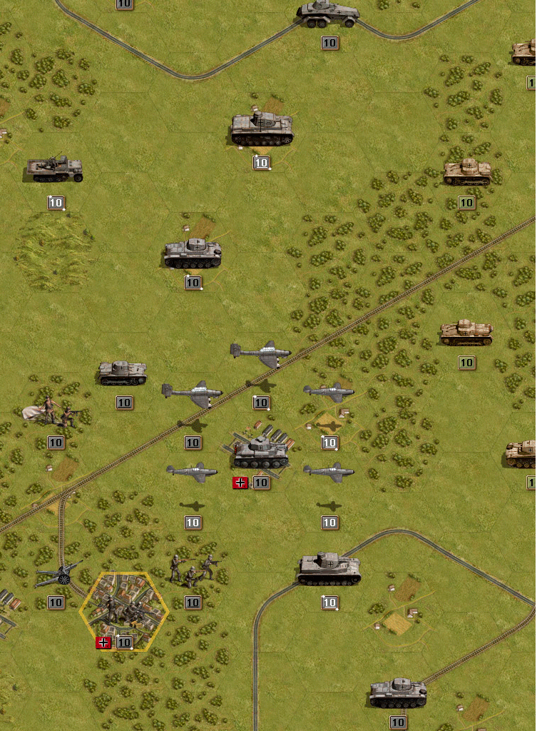
Information about actions is important, and it must be present on the screen all the time, for all players (hardcore and casual alike). If we cannot find a suitable way to present it, and instead bother the user with figuring out the existence of some hotkey/UI button, and then force him to use this button all the time, to me it is a clear sign of bad design.

So, I'm ready to accept this scheme:
* If a unit has done nothing it pulses in some way to draw your eye to it. Effect TBD.
* If a unit cannot do anything it goes dark. This includes units that have moved but not fired if there are no enemy units in range. Note this would have to be updated after every combat as units could be forced to retire in to range of a unit that had already moved.
* Units that have more or fired but not both are drawn normally.

But for the last case we must find a suitable visual indication of what action exactly is there, and by default this indication must be on. Having an option to switch it off is fine, but it should be good enough so that we are not ashamed to have it on by default, so that most players benefit from it out of the box.

As for animation effects, swirling animation may look nice, but it is way too strong to use on many units at once. I would vote for pulsing, or maybe something like a quick running speck of light across the strength label (like used on diamonds in various casual games).
Rudankort
FlashBack Games
FlashBack Games
Posts: 3836
Joined: Sat Aug 21, 2010 2:23 pm
Contact:

Post by Rudankort »

BTW, I don't see why units which have not done anything are more important that the ones which have used one of their action. If we explicitly exclude the case when remaining action in unusable, what is our rationale to claim they deserve less attention?

For example, in the screenshot I've posted from tutorial 3 infantry units next to the city are clearly important, you can use them to kill the unit in the city, after which some other unit can capture it. Why is it more important to attract attention to units which have not moved yet?
boredatwork
Staff Sergeant - Kavallerie
Posts: 314
Joined: Sat Jan 15, 2011 5:39 pm

Post by boredatwork »

Rudankort wrote:
I think that there is no point in trying to solve goal 1 on the tac map - it is too small and shows only a little portion of the map at any given time.

... There is no need to attract my attention - I'm already looking at the unit - and so there is no need to use animations and turn the tac map into moving mess at the beginning of the turn.

I somewhat disagree - in congested scenarios like Sevastopool or Crete or Kursk where the tactical screen is full of units it's not good enough to say "the minimap says there is an unmoved unit somewhere in this location" because there could be 2 dozen units at that location - something on the tactical map that says "move me" is insufficient - you very much want "here I am, move me" but without going too far towards "HERE I AM, MOVE ME."

Again as I mentioned in the other thread the contrast between Core/Aux is IMO too much for essentially a minor issue.

What about using the number colour to denote movement state instead: white numbers to denote unmoved, with black numbers to denote moved. Look at the example below (my swirls are less nice to save the photoshop work!) While it would throw PG veterans for a loop initially I'm sure by the end of the tutorial they would get used to the idea and it becomes easy to tell at a glance which have moved/fired.

Core units could then be denoted by a bit of extra flourish or underlining the number - something functiontional but not quite so in your face.

Image
Last edited by boredatwork on Fri Feb 25, 2011 5:10 pm, edited 1 time in total.
Rudankort
FlashBack Games
FlashBack Games
Posts: 3836
Joined: Sat Aug 21, 2010 2:23 pm
Contact:

Post by Rudankort »

Damn, I pressed "edit" on the message instead of "quote", and overwrote your original message with my answer. Boredatwork, I'm so sorry. :oops: Sometimes being a moderator on a forum has its disadvantages.
adherbal
The Artistocrats
The Artistocrats
Posts: 3900
Joined: Fri Jun 24, 2005 6:42 pm
Location: Belgium

Post by adherbal »

What about using the number colour to denote movement state instead: white numbers to denote unmoved, with black numbers to denote moved. Look at the example below (my swirls are less nice to save the photoshop work!) While it would throw PG veterans for a loop initially I'm sure by the end of the tutorial they would get used to the idea and it becomes easy to tell at a glance which have moved/fired.

Core units could then be denoted by a bit of extra flourish or underlining the number - something functiontional but not quite so in your face.
That works, although I was planning to using strength colour to mark low strength. Makes identifying weakened units easier.

If this is gonna be a permanent thing, we could just as well put it inside the strength box, to avoid having a new floating icon (which I really don't like).

Image

I still don't like that fact that small units get no indicator though. They are harder to notice at all, so they would really deserve a "hey I can still do something, don't forget me!" :)
boredatwork
Staff Sergeant - Kavallerie
Posts: 314
Joined: Sat Jan 15, 2011 5:39 pm

Post by boredatwork »

iainmcneil wrote:* Moved units are darkened
So, I'm ready to accept this scheme:
* If a unit cannot do anything it goes dark.

By "unit" are you two refering to the strength indicator or the actual tank itself?

IMO the former is acceptable, the later would spoil the look of the game and increase the difficulties in equipment recongnition for units that have already moved.
adherbal
The Artistocrats
The Artistocrats
Posts: 3900
Joined: Fri Jun 24, 2005 6:42 pm
Location: Belgium

Post by adherbal »

The formatting is lost, but here is bored's message
Rudankort wrote:
I think that there is no point in trying to solve goal 1 on the tac map - it is too small and shows only a little portion of the map at any given time.

... There is no need to attract my attention - I'm already looking at the unit - and so there is no need to use animations and turn the tac map into moving mess at the beginning of the turn.

I somewhat disagree - in congested scenarios like Sevastopool or Crete or Kursk where the tactical screen is full of units it's not good enough to say "the minimap says there is an unmoved unit somewhere in this location" because there could be 2 dozen units at that location - something on the tactical map that says "move me" is insufficient - you very much want "here I am, move me" but without going too far towards "HERE I AM, MOVE ME."

Again as I mentioned in the other thread the contrast between Core/Aux is IMO too much for essentially a minor issue.

What about using the number colour to denote movement state instead: white numbers to denote unmoved, with black numbers to denote moved. Look at the example below (my swirls are less nice to save the photoshop work!) While it would throw PG veterans for a loop initially I'm sure by the end of the tutorial they would get used to the idea and it becomes easy to tell at a glance which have moved/fired.

Core units could then be denoted by a bit of extra flourish or underlining the number - something functiontional but not quite so in your face.

Image
Rudankort
FlashBack Games
FlashBack Games
Posts: 3836
Joined: Sat Aug 21, 2010 2:23 pm
Contact:

Post by Rudankort »

boredatwork
Thx to Lukas, I've restored your original message. I could now clean this topic of all messages related to my mistake. Objections anyone? :)

And hide your shameful mistake huh? :P Besides, modding is fun. - Lukas :wink:
adherbal
The Artistocrats
The Artistocrats
Posts: 3900
Joined: Fri Jun 24, 2005 6:42 pm
Location: Belgium

Post by adherbal »

Illustrating current strength number colour = low strength warning indications.

Image
Rudankort
FlashBack Games
FlashBack Games
Posts: 3836
Joined: Sat Aug 21, 2010 2:23 pm
Contact:

Post by Rudankort »

If this is gonna be a permanent thing, we could just as well put it inside the strength box, to avoid having a new floating icon (which I really don't like).
Then perhaps we can do that blinking rect above or below the number? I like symmetry so much. :)
I still don't like that fact that small units get no indicator though. They are harder to notice at all, so they would really deserve a "hey I can still do something, don't forget me!" :)
Well if we darken unit icons as I and Iain suggested (boredatwork does not like the idea though), they will get some indication, but no animation. This could be solved by blinking dots from PGF, although I always thought that this was a clumsy solution, used in PG only because they could change one color in the palette and make all dots on the screen blink at once. SSI discarded this idea themselves in PG for Windows and other incarnations of the game on various platforms.
boredatwork
Staff Sergeant - Kavallerie
Posts: 314
Joined: Sat Jan 15, 2011 5:39 pm

Post by boredatwork »

adherbal wrote: That works, although I was planning to using strength colour to mark low strength. Makes identifying weakened units easier.
Looking at your example, particularly the Str2 Polish Inf near the bottom, changing the colour reduces the contrast and makes the actual strength harder to read. IMO I think the difference in shape between a "2" and an "8" or a "12" is entirely adequate to differentiate weakened units.

Could you post the same image with all white numbers for comaprison?
adherbal
The Artistocrats
The Artistocrats
Posts: 3900
Joined: Fri Jun 24, 2005 6:42 pm
Location: Belgium

Post by adherbal »

Then perhaps we can do that blinking rect above or below the number?
Image

Could you post the same image with all white numbers for comaprison?
It's an in game screenshot, so not without manualy editing all the plates. Red on green is a bit of a problem atm, but that can be adjusted.
boredatwork
Staff Sergeant - Kavallerie
Posts: 314
Joined: Sat Jan 15, 2011 5:39 pm

Post by boredatwork »

Rudankort wrote:Well if we darken unit icons as I and Iain suggested (boredatwork does not like the idea though)
I just think you should maximize the visual appeal of your beautiful artwork by allowing a player to stand back at the end of his turn and admire his tanks exploiting the break through he just created instead of a mass of low contrast (relatively speaking) dark grey blobs.
adherbal
The Artistocrats
The Artistocrats
Posts: 3900
Joined: Fri Jun 24, 2005 6:42 pm
Location: Belgium

Post by adherbal »

I just think you should maximize the visual appeal of your beautiful artwork by allowing a player to stand back at the end of his turn and admire his tanks exploiting the break through he just created instead of a mass of low contrast (relatively speaking) dark grey blobs.
Agreed. If unit glowing is ugly, than surely making them dark and low contrast isn't an option either? :wink:

BTW, some alternatives to that glowing:

Image

Image

If it blinks it can probably be more subtle.

Alternatively, this glow/outline could be used for small unit icons only, while big ones use the blinking icon in the strength box.
boredatwork
Staff Sergeant - Kavallerie
Posts: 314
Joined: Sat Jan 15, 2011 5:39 pm

Post by boredatwork »

For comparison - Blink vs. Swirl

Image Image

I think if you were going to go with the blink having it fade in/out would make it look less harsh.
Last edited by boredatwork on Fri Feb 25, 2011 5:14 pm, edited 1 time in total.
IainMcNeil
Site Admin
Site Admin
Posts: 13558
Joined: Fri Apr 01, 2005 10:19 am

Post by IainMcNeil »

Changing the colour of the strength number makes it harder to read and I think its pretty clear which units are vulnerable as you only have a number 1-10. I don;t rememebr ever finding this an issue when playing. We are trying to minimize UI components so using 2 indicators for a single piece of info seems redundent?

If we were going to use colour coding of numbers it should be to show some value that is not visible. E.g. In Commander we show a strength 1-10, but the colour of the number represents the effectiveness. So you can have a red 10 or a green 1 and vice versa.

Alex/Lukas - shall we try and set up a call to discuss. It is important we get this right and its quite hard to discuss the details over the forum.
Rudankort
FlashBack Games
FlashBack Games
Posts: 3836
Joined: Sat Aug 21, 2010 2:23 pm
Contact:

Post by Rudankort »

iainmcneil wrote:Changing the colour of the strength number makes it harder to read and I think its pretty clear which units are vulnerable as you only have a number 1-10. I don;t rememebr ever finding this an issue when playing. We are trying to minimize UI components so using 2 indicators for a single piece of info seems redundent?

If we were going to use colour coding of numbers it should be to show some value that is not visible. E.g. In Commander we show a strength 1-10, but the colour of the number represents the effectiveness. So you can have a red 10 or a green 1 and vice versa.
I tend to agree with Iain on this one. We have plenty of things we can code with colors, for example we can use red strength number if some part of strength is suppressed. Using this for "low strength" will not add much value.
iainmcneil wrote: Alex/Lukas - shall we try and set up a call to discuss. It is important we get this right and its quite hard to discuss the details over the forum.
We could try, I am free to talk atm.
adherbal
The Artistocrats
The Artistocrats
Posts: 3900
Joined: Fri Jun 24, 2005 6:42 pm
Location: Belgium

Post by adherbal »

just a very quick shining border effect test. 12 frames, 1 second duration.

Image
adherbal
The Artistocrats
The Artistocrats
Posts: 3900
Joined: Fri Jun 24, 2005 6:42 pm
Location: Belgium

Post by adherbal »

Could use this in combination with colour coded strength number.

Image

Image

Image
Kerensky
Content Designer
Content Designer
Posts: 8624
Joined: Wed Jan 12, 2011 2:12 am

Post by Kerensky »

EDIT:
Sorry, I can't stand being at the bottom of pages on forums, especially with large amounts of information.
Last edited by Kerensky on Sat Feb 26, 2011 1:40 am, edited 5 times in total.
Post Reply

Return to “Panzer Corps Open Beta”