This has been scraped together from posts made during beta and is a bit messed up but it represents some of the conventions I try to stick to.
(But be assured that these are provided by way of explanation only. Don't anyone feel you have to follow them or will be verbally pummelled for ignoring them. You damn well mod them however you wish.
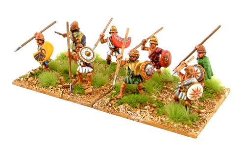
The overall look is based off fairly quick table top paint jobs. Colours are broken into base, highlight and shadow wash and a very simple top to bottom, light to dark shading. Generally you should be able to paint it or stick a transfer on it. Figure proportions are based on older minis that tended to be short and stocky rather than realistic or heroicly proportioned.
- Lighter troops are usually pale in tone. This goes for light cavalry too who'll usually have pale horses. Heavy Cavalry have black horses and anything in between, shades of brown. While I've had requests/orders to mix up the horse colours so they're more realistic .. can you imagine how much more painful it would be if you couldn't tell your lights from heavies at a glance?
- Likewise Raw troops on the whole will be lighter, paler and less decorated. The idea being that you can get a vague sense of where the strengths and weaknesses are in your line without examining every unit one by one.
- Elite troops or generally better troops have brighter, more saturated costumes, often with more detail, colour and decoration. eg. start up a battle of Germanic tribes and you'll see the superior units clearly have brighter and more decorated clothes.
- I use a fairly strict, totally matt or high shine to emphasise the difference between armour and cloth, so armoured units should usually stand out. There isn't really a halfway point so units that are 'protected' ie. have linothorax, animal skins etc. tend to be matt too. Most people couldn't tell the difference between subtly different levels of shine at this scale so you need extremes.
- Re: Metals .. its a combination of diffuse colour, spec colour and gloss. Get either one wrong and at best it'll look silly. For some reason you need your gloss values way down to get a decent highlight.
- Spears are large and oversized. Javelins are much thinner.
- When you have metal shields such as the Pikes and some cavalry, white is raw, bronze regular and iron is elite. Obviously Hoplites, with their variety of patterns on bronze shields, don't follow this. With Romans, usually the less experienced troops have paler shields, so I think its plain leather for Side0 and white for Side1.
- With Barbarians there was a differentiation using shield colour .. better were red/orange, middle yellow, poorer blue/green but feedback suggested it confused their faction. Theres still remnants of it but just for interest.
- Colour coding for side is a general side 0 =warm / side1 = cool. That's both costumes and flags. Again thats a generalisation so that at a distance you can tell them apart but if you get in close you'll find there's a mixture on both sides. Also you'll find that in regular battles with Romans, they will always use their Red costume because, (sigh), that's what people expect Romans to look like. I really tried to avoid the red v blue look thats often seen in games but unfortunately complaints about usability forced me to make some unit colours clearly one or the other.
- costume colour choices. OK so historical accuracy is always the first consideration. Then they go in game, we test out multiple battles and armies and check readability. We then edit the colours and change their ratios so that on a mixed up battle fields there is something distinctive you can latch onto and tell at a glance what they are and they'll look similar enough to all the others of the same type. This screws up all carefully planned ideals for colour blindness suitability but there are limits as to what we can do there. Historically you can look at the dyes that were available. Purple die was stupidly expensive, as was safron (rich golden yellow), were as red and crimson (that faded quickly) was relatively cheap. Plain linen/wool/cotton would be the most common. Richer people might have embroidered patches sown in or patterns applied using simple stamps and obviously this varies greatly from cuilture to culture through the ages. Printed fabrics would start to be seen some time after the opening of the silm road in 114BC but I'd expect it would be decades after that before they'd be popular/cheap enough to be seen in numbers.
- regular versus irregular troops - As a-historical as it is, regular troops - eg. Roman legions, have the same coloured tunic within any give type. Irregular units are mixed up. Makes the former feel like a trained army as opposed to the latter which feels like a rabble.
- Shield colours. Where possible we've tried to be accurate eg. All Romans in a Legion would have their shields supplied and painted a uniform colour for recognition with (in later years at least) a legion emblem on the face . . Its generally agreed that marine legions would, if not dress in blue, have blue faced shields with marine based emblems. Shield emblems should preferably be hand drawn and taken from or based on historical sources but check your time periods. Try to maintain texel density or your shields will look blurry compared to everything else. Please dont use copyrighted illustrations.
-Flag colours have been chosen so they're distinct enough for those with the most common two types of colourblindness to always be able to tell the factions. Yes they could be alot more fancy and decorative but then again they aren't decorative .. they're functional .. and ensuring they stand out as solid blocks of colour against the mass of animated limbs and weapons was paramount.
While I'm sure you can pick holes in everything the realties of time constraints means we have to choose our battles.
So feel free to mod them as you wish but do try to keep to the above conventions so your players don't have to stuggle to see passed the pretty colours. Looking forward to seeing how you guys can expand on what we've done.