
I have also now added the new heavy gun graphic (15cm).
GC '14 is looking heaps better than Kaiserschlacht now!
- BNC
WWI Mod Graphics - Looking for 3d artists!
Moderators: Slitherine Core, Panzer Corps Design, Panzer Corps Moderators
-
BiteNibbleChomp
- Lieutenant-General - Do 217E

- Posts: 3231
- Joined: Mon Jul 01, 2013 6:35 am
Re: WWI - Mod Graphics (secondary forum)
Ryan O'Shea - Developer - Strategic Command American Civil War
-
guille1434
- Major-General - Jagdtiger

- Posts: 2856
- Joined: Sun Jul 01, 2012 5:32 pm
Re: WWI - Mod Graphics (secondary forum)
asuser wrote:Don't panic, it's all ok!
Haha Guille, I have the same master picture!
For a better identification I would make the underlaying wing with more light, it's too dark. Best of all, we could use the plane icons with different camos (also Lozenge style) and markings for various air platoons!
Good work friend!
Asuser: You are right, the lower wing could use some more light on it... Please, make the modifications, that way I can alos make the same thing as you tho the base icon that I made, in order to be able to use the Lozenge camo skin I prepared. IT looks good alrteady, it will surely look better.
- Attachments
-
- SE_Fokker_D.VII.png (23.87 KiB) Viewed 7254 times
-
- Fokker_D.VII-Lozenge.png (23.69 KiB) Viewed 7254 times
Last edited by guille1434 on Mon Apr 14, 2014 4:32 am, edited 1 time in total.
-
guille1434
- Major-General - Jagdtiger
- Posts: 2856
- Joined: Sun Jul 01, 2012 5:32 pm
Re: WWI - Mod Graphics (secondary forum)
Here are the Lozenge type camo skin files I made for applying to German WWI aircraft using the DCS software. It comes in two variations (vertical and horizontal) and also in two different color patch sizes (for bigger aircraft, like bombers). I hope you like it
Asuser: You can test this with any WWI aircraft base icon you have, and see if the results are good! I think that the new Fokker D.VIII base icon with lighter lower wing will be an improvement.
BNC: Yes, got confused, I did not know about the Fokker E.V / D.VIII, I will make an icon for it also, it looks very much like a Dr.I triplane fuselage with only a parasol wing on it. Anyway, the D.VII was an imprtant unit and I think it deserves to be represented in any WWI mod.
- Attachments
-
- 03-German WWI Lozenge-1.png (33.79 KiB) Viewed 7329 times
-
 German WWI Lozenge DCS Skin Pack.rar
- (154.64 KiB) Downloaded 252 times

Re: WWI - Mod Graphics (secondary forum)
BiteNibbleChomp wrote:It's really good, and would fit well for the 1914 French infantry! Only thing we need now for it is a graphic that will work in the game!
- BNC
I give my best...and here is the first useable infantry icon for French early:
- French_Inf_Early.png (25.15 KiB) Viewed 7324 times
The late uniform follows next...
Guille: I will check the Fokker D VII as I said...and for the Lozenge camo style we could work closely together. It's a little bit difficult to create with the very small looking parts of different color spots. For this I Need a little bit practice for the perfect look...

Re: WWI - Mod Graphics (secondary forum)
There are some awsome WWI icons gathering here, so I could not resist but made a few early concept design screenshots to see how they would look like together in-game:
Fig.1:
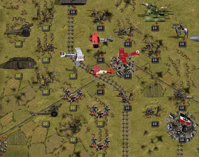
- Althought the new French infantry looks great on its own, when standing next to other vanilla style units I can see some difference in style. Therefore I suggest either remaking all the necessary infantry units in the same style or recolouring the existing vanilla French infanty icons using the same colours.
- The air units might need a little retouch when all are ready - the French Nieuport is too sharp especially when compared to the German triplane. It is very easy to reduce its contrast / sharpness a bit and / or to increase the other one's to achieve a more consistent look.
- The camo pattern of the 30.5 cm Mörser stands out a bit. I suggest making it the same grey (feldgrau) as the other German (Axis) units, or all other German (Austro-Hungarian) arty units should have the same camo for consistency. I think it is very hard for the eye if one has to recognize differently coloured units belonging to the same nation.
- The tanks are spot on, they go together perfectly with the existing vanilla units.
Fig. 2:
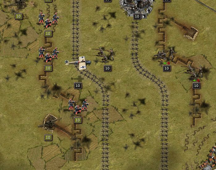
- The German Fokker Eindecker fighter looks just about perfect in this screenshot. It would be nice to have all other air units in the same style if possible. I mean having the same level of sharpness, lightness, saturation, contrast, relative size, angle of view, etc etc.
- I think continuous trench lines in a WWI game look better than the vanilla sectioned ones. Either these could be used (created by Massi) or the vanilla ones could be changed so that trenches go from one end of a hex to the other. I would prefer modifying the vanilla ones as those are somehow easier for the eyes and in the vanilla fortification hexes there are three trench lines close to each other instead of just one.
- Barbed wire may or may not be used in front of the frontline hexes. If not, some barbed wire could be added to the frontline hexes as a visual extra. The disadvantage of having seperate barbed wire hexes is that it would make frontlines too far from each other and it would also affect the scale of the map.
I made some continuous trench lines with bomb craters for the K.u.k. General mod for PG in 2006:
And the other slitherine game, Commander: The Great War has (almost) continuous trench lines too:
So I vote for continuous frontlines...
Fig.1:
- Althought the new French infantry looks great on its own, when standing next to other vanilla style units I can see some difference in style. Therefore I suggest either remaking all the necessary infantry units in the same style or recolouring the existing vanilla French infanty icons using the same colours.
- The air units might need a little retouch when all are ready - the French Nieuport is too sharp especially when compared to the German triplane. It is very easy to reduce its contrast / sharpness a bit and / or to increase the other one's to achieve a more consistent look.
- The camo pattern of the 30.5 cm Mörser stands out a bit. I suggest making it the same grey (feldgrau) as the other German (Axis) units, or all other German (Austro-Hungarian) arty units should have the same camo for consistency. I think it is very hard for the eye if one has to recognize differently coloured units belonging to the same nation.
- The tanks are spot on, they go together perfectly with the existing vanilla units.
Fig. 2:
- The German Fokker Eindecker fighter looks just about perfect in this screenshot. It would be nice to have all other air units in the same style if possible. I mean having the same level of sharpness, lightness, saturation, contrast, relative size, angle of view, etc etc.
- I think continuous trench lines in a WWI game look better than the vanilla sectioned ones. Either these could be used (created by Massi) or the vanilla ones could be changed so that trenches go from one end of a hex to the other. I would prefer modifying the vanilla ones as those are somehow easier for the eyes and in the vanilla fortification hexes there are three trench lines close to each other instead of just one.
- Barbed wire may or may not be used in front of the frontline hexes. If not, some barbed wire could be added to the frontline hexes as a visual extra. The disadvantage of having seperate barbed wire hexes is that it would make frontlines too far from each other and it would also affect the scale of the map.
I made some continuous trench lines with bomb craters for the K.u.k. General mod for PG in 2006:
And the other slitherine game, Commander: The Great War has (almost) continuous trench lines too:
So I vote for continuous frontlines...


slitherine.com/forum/viewtopic.php?f=147&t=47985
slitherine.com/forum/viewtopic.php?f=147&t=36969
Re: WWI - Mod Graphics (secondary forum)
Hi Mc Guba,
thank you very much for the nice compilation of "all together working new units" - screenshots!
Some comments from me:
- French infantry: It is clear, that the look is now different. But I made that unit with one target: To make a new, more realistic one. And then, step after step the other nations with a new interesting look! So it's sound crazy for me and the modding heart is bleeding, if you kick off the new unit because the older ones don't fit ... otherwise, every player could use the units he will or prefer...
- French Nieuport is too sharp? I understand the construction job in this way: To make the best result for a maximum of detailness... So let us make together the best looking planes we can, Guille, what do you say?
- The camo pattern of the 30.5 cm Mörser stands out: Ok, here we can play with colours and light ... nobody knows the "right" colour of this time or...? And think about this idea: The vanilly Icons for artillery have mostly all the same grey colour more or less, so we could make a variety of German: green/grey and Entente: brown/grey ... for a more uniform look...difficult decision.
- The tanks are spot on: Yes great work! Additional, the tanks were used also from the other side, with other camo skins and national insignias.
- The German Fokker Eindecker fighter looks just about perfect in this screenshot: Yes... If we make a new fresh mod, then let us make new fresh icons...I would say!
- I think continuous trench lines in a WWI game look better than the vanilla sectioned ones: Yes, the vanilla trench lines are...boring and like drainage tubes... let us make the right ones ...
- Barbed wire may or may not be used in front of the frontline hexes. If not, some barbed wire could be added to the frontline hexes as a visual extra. The disadvantage of having seperate barbed wire hexes is that it would make frontlines too far from each other and it would also affect the scale of the map: Additional idea: We can use it as a separate "minefield". Place it on a separate hexfield for a perfect block/defence function.
-So I vote for continuous frontlines...: Yes me too! And the bomb crates we put on separately with the hex action function with different sizes, so we get a real crated landscape of the WW1!
Greetings!
Last edited by asuser on Sun Apr 13, 2014 9:07 pm, edited 1 time in total.

Re: WWI - Mod Graphics (secondary forum)
Great work in here guys. The new graphics are really adding punch. And yeah, IMO the continuous front lines would be an outstanding improvement. 
Go deep here: slitherine.com/forum/viewtopic.php?f=147&t=49469
-
BiteNibbleChomp
- Lieutenant-General - Do 217E
- Posts: 3231
- Joined: Mon Jul 01, 2013 6:35 am
Re: WWI - Mod Graphics (secondary forum)
If someone modifies the original graphics (3 trenches) and adds them to the end of the overlays.png, I'll be able to add them to GC14! However, I want to still be able to use the original graphics AS WELL, for certain scenarios (eg. Liege14)
Bomb craters - maybe not....
- BNC
Bomb craters - maybe not....
- BNC
Ryan O'Shea - Developer - Strategic Command American Civil War
-
LandMarine47
- Major-General - Tiger I

- Posts: 2490
- Joined: Sun Oct 28, 2012 10:44 pm
- Location: Texas
Re: WWI - Mod Graphics (secondary forum)
I disagree with you there! With the right tools and talent, someone could make a small but long strip of land filled with craters. A wasteland if you will, to represent the No Mans Land of WW1
-
BiteNibbleChomp
- Lieutenant-General - Do 217E
- Posts: 3231
- Joined: Mon Jul 01, 2013 6:35 am
Re: WWI - Mod Graphics (secondary forum)
Most of the No Man's Land has those annoying Barbed Wire units in it! They would cover up all of the bomb craters.
- BNC
- BNC
Ryan O'Shea - Developer - Strategic Command American Civil War
-
LandMarine47
- Major-General - Tiger I
- Posts: 2490
- Joined: Sun Oct 28, 2012 10:44 pm
- Location: Texas
Re: WWI - Mod Graphics (secondary forum)
Well that screenshot does have a tiny strip of land (unless you plan on changing that in the future)
-
BiteNibbleChomp
- Lieutenant-General - Do 217E
- Posts: 3231
- Joined: Mon Jul 01, 2013 6:35 am
Re: WWI - Mod Graphics (secondary forum)
You forgetting what the wire unit looks like?
- BNC
- BNC
Ryan O'Shea - Developer - Strategic Command American Civil War
-
LandMarine47
- Major-General - Tiger I
- Posts: 2490
- Joined: Sun Oct 28, 2012 10:44 pm
- Location: Texas
Re: WWI - Mod Graphics (secondary forum)
No, but I'm just saying, I'd look pretty nice seeing that amount of detail! But I suppose barbed wire and bomb craters don't mix.... In most situations
-
BiteNibbleChomp
- Lieutenant-General - Do 217E
- Posts: 3231
- Joined: Mon Jul 01, 2013 6:35 am
Re: WWI - Mod Graphics (secondary forum)
LandMarine47 wrote:No, but I'm just saying, I'd look pretty nice seeing that amount of detail! But I suppose barbed wire and bomb craters don't mix.... In most situations
- BNC
Ryan O'Shea - Developer - Strategic Command American Civil War
-
guille1434
- Major-General - Jagdtiger
- Posts: 2856
- Joined: Sun Jul 01, 2012 5:32 pm
Re: WWI - Mod Graphics (secondary forum)
Hello to all!
It is a good thing to be able to discuss all the matters about those new icons here... This is what I am thinking about some of the topics mentioned...
French Infantry: The "style" of the icon looks different, indeed, but the icon is a very good one! This is what would I do to try to make the icons look more "uniform"
a) The "new" french figures look thicker than the figures which compose the other icons, so I would say that little by little, we can make the figures of the other icons "thicker" also... Anfield did just that with the WWII infantry icons, and the result was excellent, so, we can ask him for help, or at least ask him permission to use his modified figures to modify the current "vanilla" icons. So all human figures will look similar in its shape at least.
b) It is true that the french used a very colorful uniform (reminiscent of the Napoleonic era, I would say) at a time when the germans were using a much more "modern" looking, and more practical in the sense of camuflage, "feldgrau" uniforms. So, the colorful French troops are correct... Maybe we can tone down the brilliant red trousers a little (no one expects the red trousers look sooo red after some time out in the battlefield). Just tone down it a bit, to make it less conspicuous, but at the same time, to keep the icon "identity".
Tanks: Indeed, they look right on spot... I am very glad they do so!
Artillery: May be using "monochromatic" (i.e. not camo patterned) one tone units with a distinct color for each country/side is a good one... Also, we can keep that good looking camouflaged artillery units reserved for some special unit given to any of the warring factions (like the SE units of the regular game with their special camouflage).
Planes: The Fokker E.III is perfect, as said, about the Nieuport, it is also very good, but maybe it looks a bit oversized? Also, may be we can make it with its wing leading edge more perpendicular to the fuselaje line (it sounds strange, but this is the "perspective" effect that stock game aircraft icons have).
About the german planes I made: The Albatros fighter looks good enough... The only one which look "out of place" is the Fokker D.VII: Its upper wing looks too brilliant, and the lower one too dark. Also its perspective is not the same as the other ones, as it looks that the aircraft is banking in a more steep angle than the others... So I will try to work on it to make it look more like the others. And yes, the Fokker Triplane upper wing could use some more sharpening...
EDIT: Reworked the Fokker D.VII, I think it's better now, looking more in the same style as the other aircraft... I re-uploaded two icons of it in my previous post here about this aircraft... But maybe Asuser will improve it further
Trenches: I vote also for continuous trench lines...
Craters: I would like also to see them in the map (they were very common in WWI battlefields), but also to have some effect to the units movement (as was the case historically)... For example heavily cretered hexes could be classified as "swamps" (the shell holes tended to be filled with water) and the units running through them will lose more movement points than if they were going over flat terrain... Just an idea.
I hope these comments will help...
-
guille1434
- Major-General - Jagdtiger
- Posts: 2856
- Joined: Sun Jul 01, 2012 5:32 pm
Re: WWI - Mod Graphics (secondary forum)
I think the Fokker D.VII looks better now than before when in company...
- Attachments
-
- WWI1a.jpg (226.56 KiB) Viewed 7253 times
-
BiteNibbleChomp
- Lieutenant-General - Do 217E
- Posts: 3231
- Joined: Mon Jul 01, 2013 6:35 am
Re: WWI - Mod Graphics (secondary forum)
So is anyone making the new trench graphics (old ones to the edge of the hex) ?
- BNC
- BNC
Ryan O'Shea - Developer - Strategic Command American Civil War
Re: WWI - Mod Graphics (secondary forum)
Additional to Guilles Lozenge pack I made also some camo stuff:
With a little combination of colours we could get some nice effects:
For the perfect finish we need the crosses at the sidewalls, personal and division markings and some heavy duty marks. The work isn't finished yet...
- LozengeAS01.zip
- (200.75 KiB) Downloaded 250 times
- LozengeAS02.zip
- (123.75 KiB) Downloaded 237 times
With a little combination of colours we could get some nice effects:
- Fokpak.png (53.24 KiB) Viewed 7219 times
For the perfect finish we need the crosses at the sidewalls, personal and division markings and some heavy duty marks. The work isn't finished yet...
-
guille1434
- Major-General - Jagdtiger
- Posts: 2856
- Joined: Sun Jul 01, 2012 5:32 pm
Re: WWI - Mod Graphics (secondary forum)
Very nice camo skins!
Re: WWI - Mod Graphics (secondary forum)
Very good. I like the idea of applying the swamp attribute to heavily cratered hexes. That way, not only would we gain a tile that is visually appealing, but with the movement effects, it would also lend a sense of realism as well. Great idea!guille1434 wrote:Craters: I would like also to see them in the map (they were very common in WWI battlefields), but also to have some effect to the units movement (as was the case historically)... For example heavily cretered hexes could be classified as "swamps" (the shell holes tended to be filled with water) and the units running through them will lose more movement points than if they were going over flat terrain... Just an idea.
Go deep here: slitherine.com/forum/viewtopic.php?f=147&t=49469