For LoV Ultimate provides an equally functional, but graphically revised "User Interface". We want to raise the game atmosphere...
Already enclosed in the vanilla version, is our modified start menu ... Whether this start screen also comes just as in the Ultimate ... I do not know yet, I'm experimenting a little ...

- startscreen.jpg (105.69 KiB) Viewed 9298 times
This screen shows no tank or another weapon ... In terms of our title "The Legacy of Versailles", is to see the
Compiègne Wagon in which Germany signed in November 1918 the
"First Armistice at Compiègne", which ended de facto the First World War and culminated in the Treaty of Versailles. The Treaty of Versailles is considered by some historians as one of the main reasons that led to World War II... Reason enough for us to make this point clear in the name of the mod!
Oh ... That's not official, in theory LoV supports two additional languages: Spanish and Portuguese ... But there is no full support, for a localization was applied Files/ placeholder, but these are not translated, except the start menu buttons.
TRIVIA: The railway dining car was a part of a museum after the end of the "Great War". Specially for the
surrender of the French in 1940, Hitler ordered extract the wagon from the museum ...
November 2012
First Steps ... an early color study:
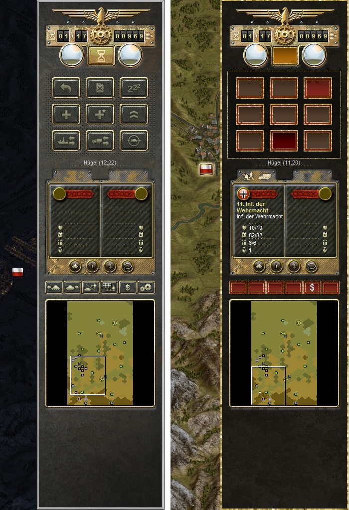
As a result, were able to convince the darker and richer colors ... We came to the conclusion that the UI needs strong and contrasting colors ...
PS: The UI on the left is indeed original, but the tiles are unusually dark ... because I have tested graphically - now no longer pursued - the idea of night missions ...
Just a few days after the color study, I have begun to restructure the buttondesign ... The Buttoncharacters should be different from the original, for various reasons... among others, because it would have been difficult to extract the original characters. The buttons should be identifiable despite new design. As far as it was useful, I left the button characters and used a similar symbolism ... Therefore icons look not soooo different, as perhaps feared ... At the button positions and functions we did not want to mess around, because it was already found a relatively optimal distribution...
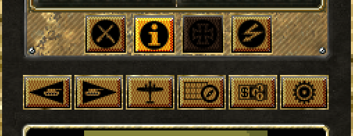
The first buttons ...
Dark brown = Disabled
Light Brown = stand-by
Orange = Enabled
While the bottom buttons are based on the original symbolism, I have designed some completely new symbols for the middle four buttons ...
To explain the characters ... On the right side of the messages button ... You can see the Bundeswehr telecommunications flash ... Wehrmacht symbols could not convince here ... The second button from the right is the "reserve list" button and shows an "Iron Cross". From the past to the present day in Germany it is association mark all reservists associations ... That's why I made the same choice and sat the Iron Cross as a button icon for the reserve list.
The comparison display button with the "i" already optimal ... When you press the "Unit List" button, all combat units are shown ... Inspired by the Badge of the Wehrmacht, that (in one version) shows a crossed stick grenade and a sword / dagger ... I have tried this combination empathize ... but even here it was not convincing so right, so it was revised again a little later ...
To be continued in a few and a couple of more days ...