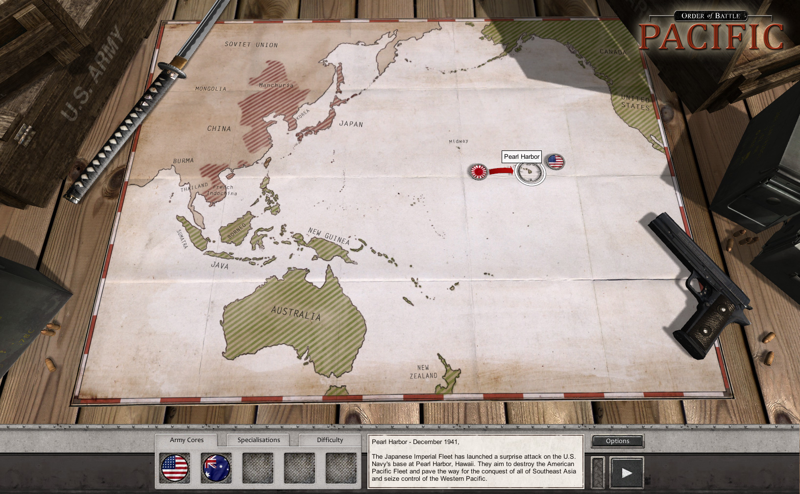
I assume this is a "spiritual successor" to
Pacific General?
This game really looks fabulous in many ways, but in some it doesn't so here's some (hopefully) constructive criticism of appearance:
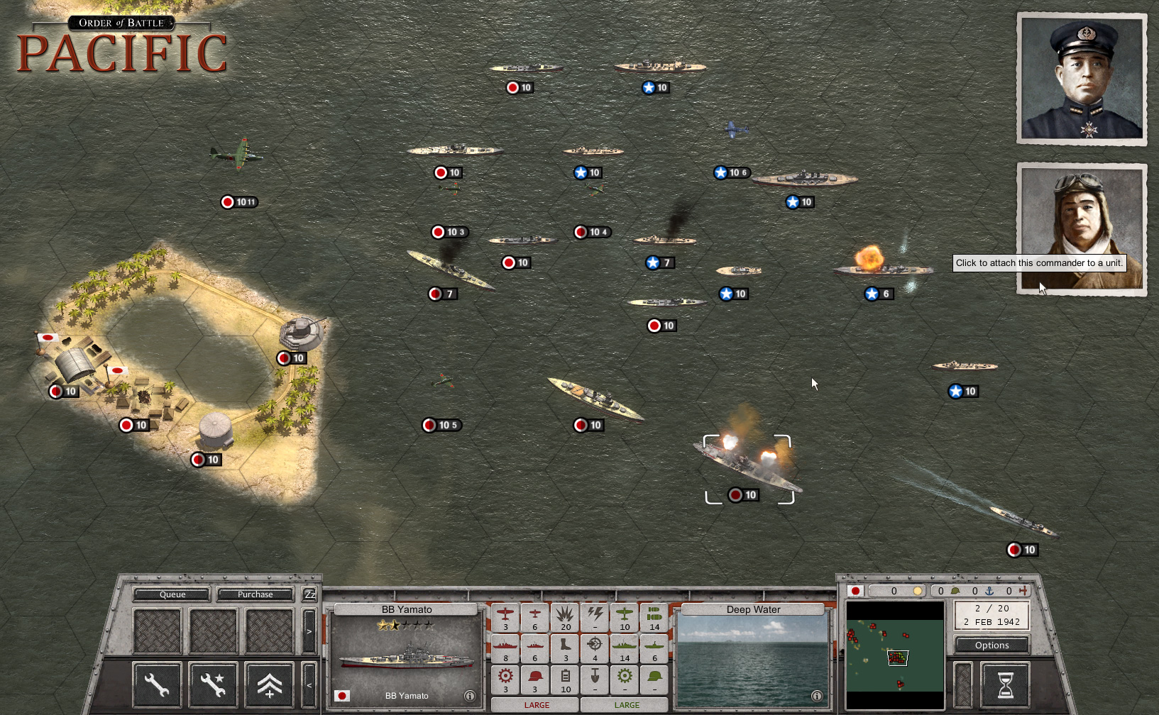
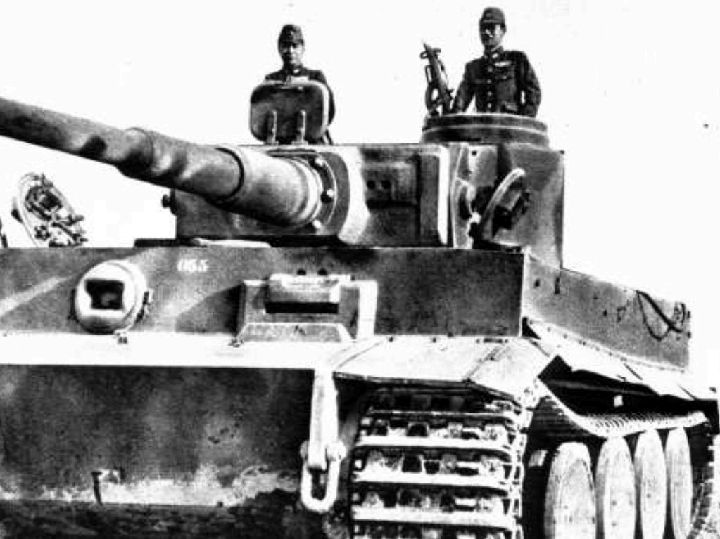
1) It's commonly-known that the BEST way to identify ships (or specific ship classes) is by their
side view, silhouette profile as some have single or multiple funnels, command towers, other distinctive features, camouflage to foil subs, etc. which is why most encyclopedias and guides look like this:
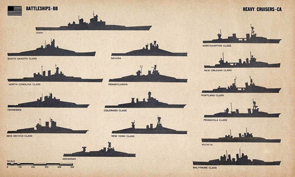
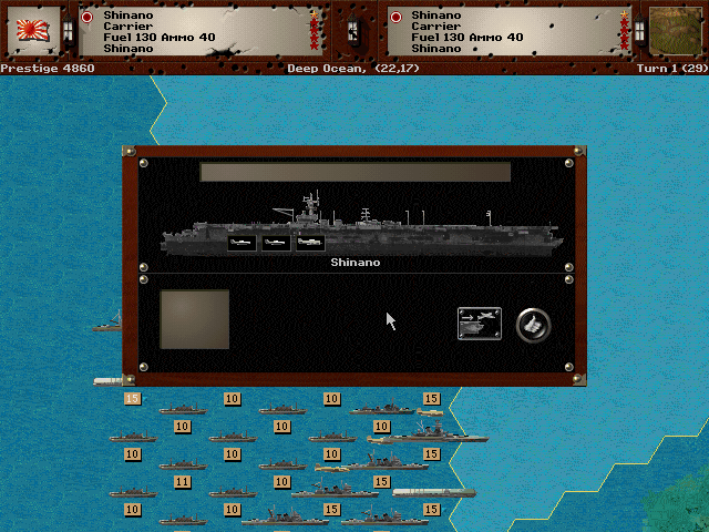
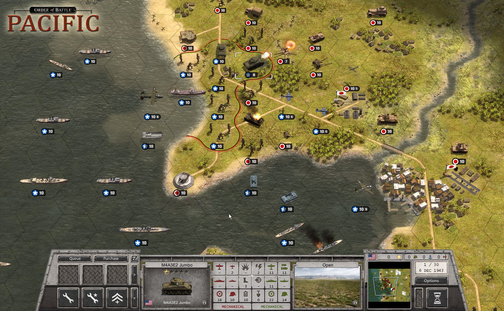
Most ships look too much the same from the pure top view --carriers are rectangular, nearly everything else has the same pointed stern and prow across all countries. It's POV perspective of high altitude bombers only.
Perhaps more of a 3/4 view (like the land units) could serve as a compromise?
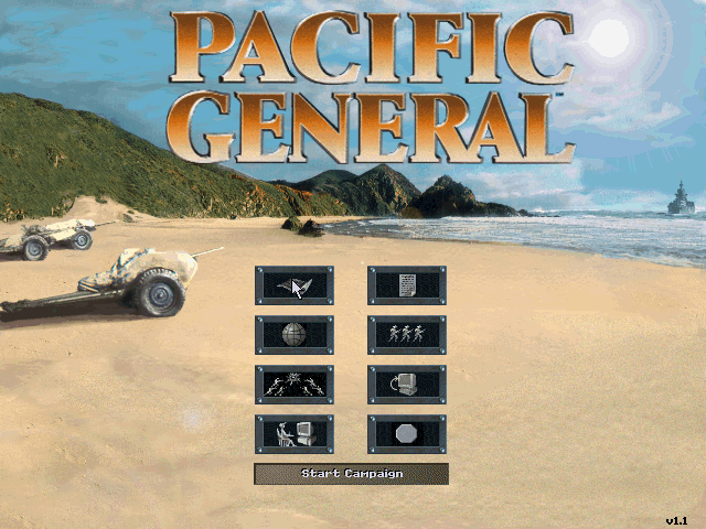
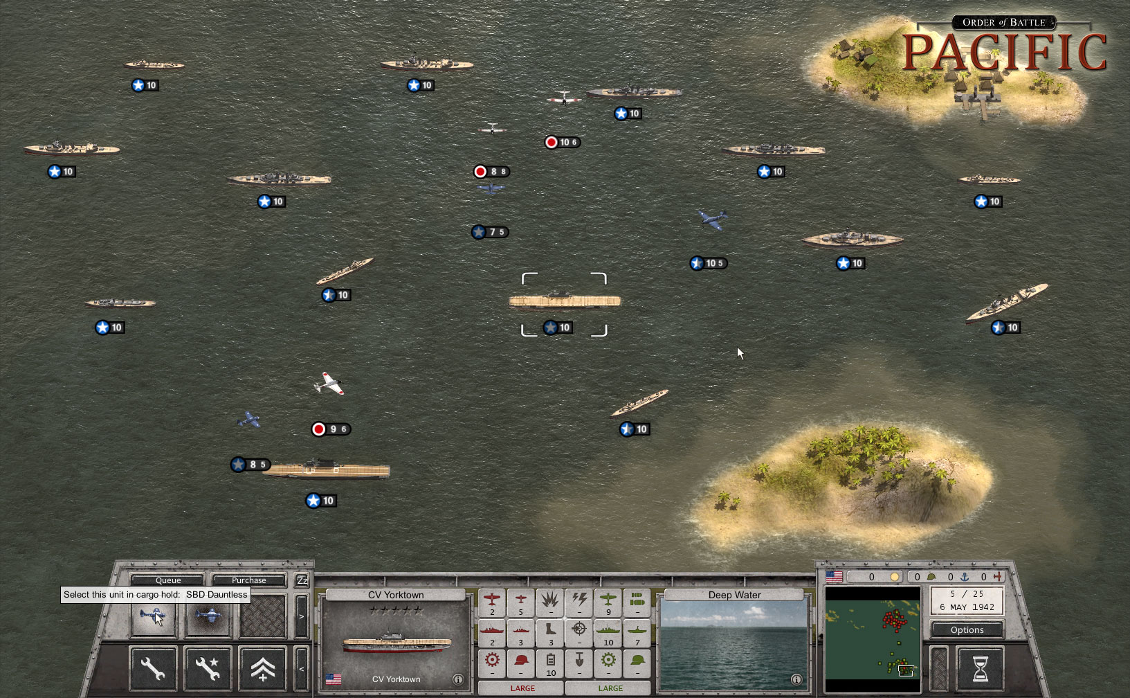
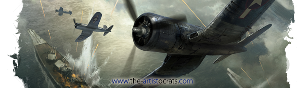
The Yamato BB in Pac.Gen., for example (Armory e-roster), is a muuuuuch more impressive-looking and distinctive ship icon at the bottom of the screenshot here.
These
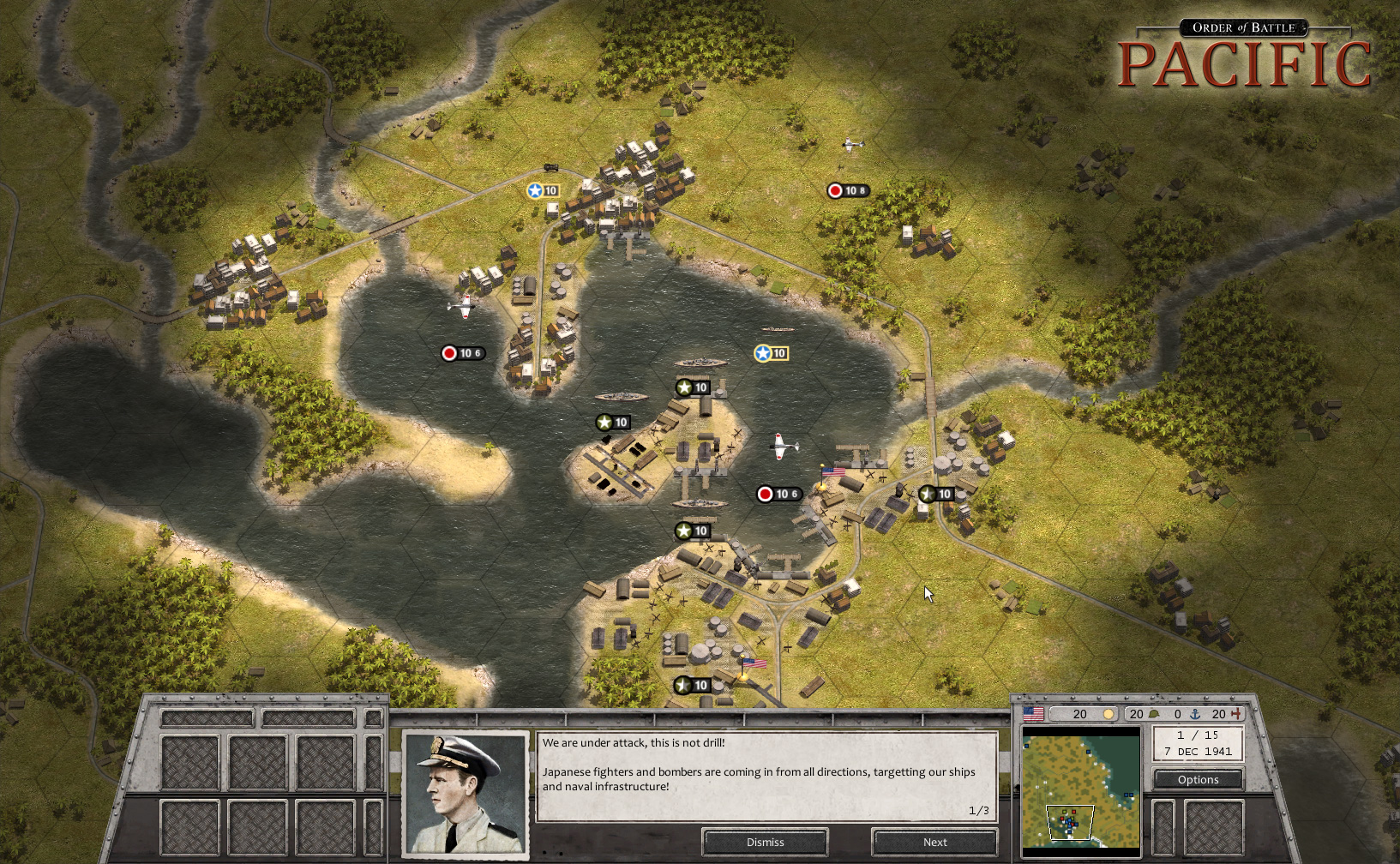
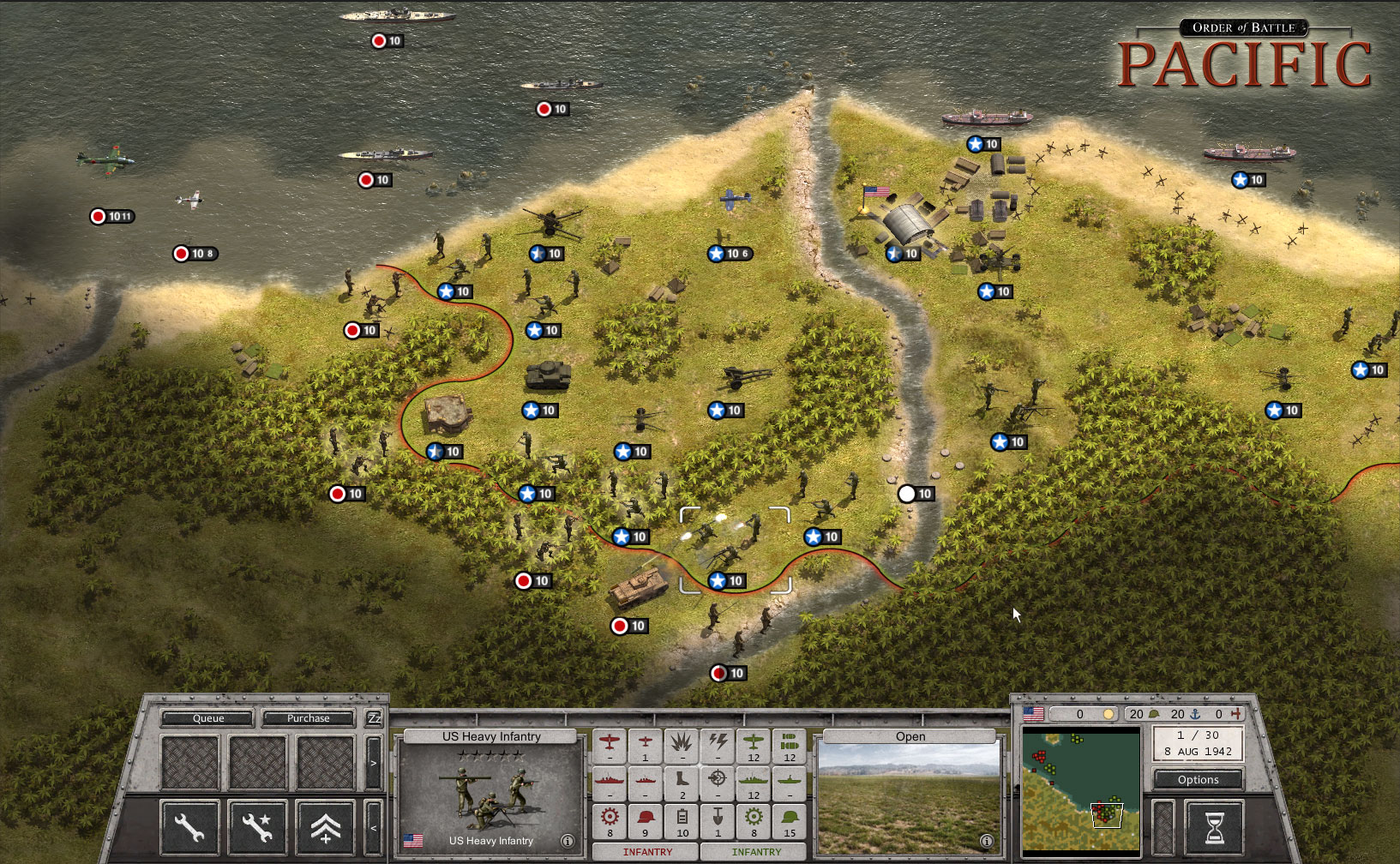
OoB: Pacific ships kind of look dinky too compared to the land units. The look is inconsistent between the two.
2) The ocean (though it has a realistic texture of waves) appears greenish/brownish/grey? That looks yucky! The ocean is supposed to be
blue because water reflects a blue sky. And what happened to reefs and shallows? Besides visual appeal, they actually serve a purpose in restricting larger vessels (BB, CV, CA) from getting too near certain islands.
Perhaps old Pacific General was deemed too overly-colorful in comparison:
but the real world of the South Pacific is too:


Perhaps a tint of blue to deeper areas and some aqua shallows can be added? Just a suggestion. Nice work, otherwise!


