

sorry guys , i lost interest in about 10 minutes after playing the tutorial and the first mission in the 1939 campaign. This is not even close to panzer general and it's a shame really.
- units are too small , on high resolution systems this will not look good. The same goes to the map and the graphical representation on roads , forests and so on...
-no wide monitor support (on my 16:10 monitor i have black bars around the game interface)
- no loading bar , you don;t know when the mission has finished loading
- graphics are poor
-the unit moving animation is terrible.
-only 1 zoom level available and unfortunately not one you can get closer to your units. panzer general had a much better ratio and it's a >10 years old game
-the colour of the available moving space should be trasparent and not white
-attacking interface is rubish. 2 colours that have nothing in common with what is on the field and 2 numbers you really don't know who's losses are who's. Terrible. PAnzer General had 2 flags so you know who's loosing the units
-the same sound when attacking with tanks / airplanes / artilery
What is this "team blue" in the tutorial? This is a WW2 TBS and not call of duty shoot'em up.
-No detailed unit screen. Everything is cramped. You don't even know over how many hexes an artilery piece can fire .'
I would not call this a beta version , more like a early alpha build.
lost interest in 10 minutes
Moderators: Slitherine Core, The Lordz, Panzer Corps Design, Panzer Corps Moderators
-
IainMcNeil
- Site Admin

- Posts: 13558
- Joined: Fri Apr 01, 2005 10:19 am
Thanks for them mail but I think you've missed something as there are 3 zoom levels. Combat animations are not in yet, loading bars are not in yet and many other features are still being worked on.
All of the points you mention are fixable so please give more details on the issues you found and how we can improve them. That is the whole point of the beta test!
The tutorial is a boot camp. It is excercises with German v German untis before you are sent tot he front which is why you have blue vs red like in all army maneouvres. Briefings are not written yet so maybe this is not clear. The tutorial is also not in yet.
Please keep playing and give us your detailed feedback. Thanks!
Re: lost interest in 10 minutes
Thanks, negative feedback is also useful. A few questions.
So what hex size would you suggest to use instead?clocky wrote: - units are too small , on high resolution systems this will not look good. The same goes to the map and the graphical representation on roads , forests and so on...
You are talking about the main menu, correct?clocky wrote: -no wide monitor support (on my 16:10 monitor i have black bars around the game interface)
Can we get a bit more specific than that? What exactly you didn't like? Perhaps you could give a sample of a game which has a perfect graphics from your point of view?clocky wrote: - graphics are poor
Not sure I understood this remark. Transparent color means no color, doesn't it, and so it cannot be used to indicate anything. Can you describe what would be an ideal indication from your point of view?clocky wrote: -the colour of the available moving space should be trasparent and not white
You can see all unit stats, range included, if you toggle the stats panel on. This is done using "i" button in the UI.clocky wrote: -No detailed unit screen. Everything is cramped. You don't even know over how many hexes an artilery piece can fire .'
It takes a lot of time to come up with the right game rules and balance the scenarios in a game like that. That is the reason why we started the testing process early. Graphics and effects will catch up by the time we come close to finishing the balancing work.clocky wrote: I would not call this a beta version , more like a early alpha build.

Panzer Commander says:

Just kidding.
Seriously though, I run at 1680x1050 resolution, and I don't have black bars except for the un-stretched mini-map. Maybe your video drivers are out of date?
http://img847.imageshack.us/img847/4319/52512938.jpg
What does your screen shot look like?
EDIT: He may have been talking about the main menu actually. My monitor has a 1cm black bar on the left and right sides on the main Tiger menu screen. My monitor has a black plastic border though, I never even noticed it.
A lot of his other comments are mostly aimed at unfinished aspects of the game, but I do agree with the 'available moving space' part. White washing the board, especially with air units, is an eye-sore.
For the record, this is sort of the person and complaint I warned you devs would be your most common gripe about the game. Currently, the game lacks the 'ohh shiny' quality that attracts more... let's say modern gamers. Once serious work begins on enhancing the audio and video qualities of unit interaction, I'll have plenty to say, but for the time being you might want to stress this to 'testers' that they are not necessarily 'players'.
1. well first of all, as i said , i don't like the size of the units. They are too small. i suggest making the unit as close to the hex size , almost like panzer general if not bigger. You have to take in consideration all users not only the ones with 1024x768 resolutions. On my 1980x1080 monitor it is painfully to play this game as units are too small.
2. graphics and animations are poor. i wanted some eye-candy graphics , i wanted dust and smoke from units that move or taking damage. There are some things that really don't fit in this game like when selecting a unit a white frame that does not fit there appears.
3. about the black bars , yes it is in the menu.
4. when trying to move a unit , the area to which this unit can move is displayed in a white colour. i wanted to make this as transparent as possible so it will not feel like you are playing chess.
5. when moving units mouse cursor should change accordingly.
@Kerensky , i'm far from a "modern gamer"as you put it, as i played dune back in the days (so now you can guess my age) but i do appreciate good looking graphics as they help me immerse in the game universe. arguing on the graphics vs the rest of the game aspects is a lost battle since 1983.
PS : banning me doesn't make a difference
Last edited by clocky on Tue Mar 22, 2011 9:02 pm, edited 1 time in total.
I see. What are the phisycal dimensions of your monitor?clocky wrote:1. well first of all, as i said , i don't like the size of the units. They are too small. i suggest making the unit as close to the hex size , almost like panzer general if not bigger. You have to take in consideration all users not only the ones with 1024x768 resolutions. On my 1980x1080 monitor it is painfully to play this game as units are too small.
So how would you indicate selected unit instead?clocky wrote: 2. graphics and animations are poor. i wanted some eye-candy graphics , i wanted dust and smoke from units that move or taking damage. There are some things that really don't fit in this game like when selecting a unit a white frame that does not fit there appears.
We thought that this would be somewhat redundant when you already see action icons marked on the map (dots for movement, truck for movement in transport etc.).clocky wrote: 5. when moving units mouse cursor should change accordingly.
1. 24" monitor
2. selected unit should show up as a bolded hex (just like panzer general) or if you want something else a semi-transparent green hex. (that should turn red if the unit has made it's move)
3. the maps look much better in panzer general. why can't panzer corp improve on that? right now they look kind of cartoonish
Last edited by clocky on Tue Mar 22, 2011 9:18 pm, edited 2 times in total.
I said I was kidding, just adding a little humor.
The devs have gone to great pains to make the impression that the graphics for the units are not 'poor'. Believe me, I'll tried to get them to budge on this topic, you'll see that in some of the other art threads floating around here. I wouldn't say the animations are poor though, more like non-existent.
I think it's hard to criticize and judge an aspect of the game that obviously hasn't even begun to be worked on yet though. Namely, the visual and audio feedback the player receives from units moving and fighting. Don't get me wrong, it's worth mentioning so they are aware of it, but condemning it would be like... complaining a skyscraper doesn't look imposing because the blue prints were printed on small paper.
2. Color blind gamers will have issue with color coded indicators.clocky wrote:2. selected unit should show up as a bolded hex (just like panzer general) or if you want something else a semi-transparent green hex. (that should turn red if the unit has made it's move)
3. the maps look much better in panzer general. why can't panzer corp improve on that? right now they look kind of cartoonish
3. Original Panzer General? No. Panzer General 2? Hmmmm yea possibly.
 vs
vs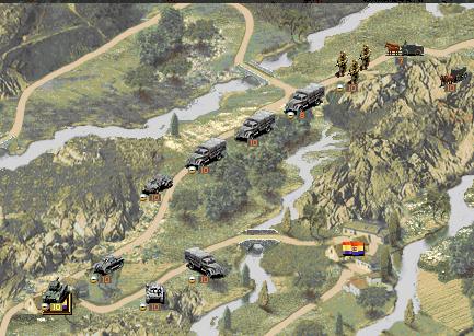 vs
vs
sorry , i was talking about panzer general 2.
bug : after alt+tab the black frames are here to stay : http://img17.imageshack.us/i/framese.jpg/
bug : after alt+tab the black frames are here to stay : http://img17.imageshack.us/i/framese.jpg/
-
boredatwork
- Staff Sergeant - Kavallerie

- Posts: 314
- Joined: Sat Jan 15, 2011 5:39 pm
Meh.
I wouldn't want PG2 as the target to which PzC should strive.
- the "cutesyness" of the PG2 maps would look horrible on the maps of similar tile counts of much larger scope and smaller scale. ex Lillehammer in PG2 looks fine because it's so small - paint all of Norway in the same "realistic" style and features are either so muddied as be unreadable (multiple fjords and islands within a single tile, for example) or have to be so grossly exagerated that the result is more comical than a stylised tile based art work.
- Realistic units driving over top of a flat painting didn't look particularly realistic.
- It was harder to tell what tiles "counted as" - ex all the tile that had some trees painted on them without having enough to qualify as a forest.
- Most importantly tile based map art is infinitely easier to allow player generated content - it took about 30 minutes to do a PzC version of PG's Kiev map today. It would take weeks in photoshop to paint something similar in PG2 style.
Where PzC might be improved IMO is largely in adding a bit more variety (or at least making it easy for users to add additional artwork post release to add variety) to break up the large area of "sameness":
- a bit more variety in hues - the large areas of clear terrain are all a single colour of green - you could have lighter green tiles and tiles with more brown in them.
- more "extras" for tiles - single buildings, single farms, single farms, single hills, tree lined rivers and roads to add variety to "standard" terrain without changing it's function.
- terrain that "spills" - while it would obviously be alot more work, having terrain like cities, farms, and forests "spill" over the hex side into ajacent tiles to make the terrain look a little more irregular.
- connected hills and mountains - in the PG screen above the mountain tiles sprawl out making them look more like mountains, IMO. Currently the mountains look a bit too prairie dog mound-ish
I would also suggest the possibility of reducing the overall saturation by 25-35% to make the green a bit less GREEN.
Here's a before:
http://i8.photobucket.com/albums/a40/El ... ar22-1.jpg
And a very rough after - the hills kinda suck and everything was slightly blurred but you can hopefully see the idea:
http://i8.photobucket.com/albums/a40/El ... ar22-3.jpg
While "unit facings" would be nice eye candy I can also live without it as it makes it easier to add player generated unit artwork to fill in the gaps of the OOB. (not having to generate 6-12 pieces of art per unit - easy enough for 3D users but a bit of a chore for 2D artists.)
-
IainMcNeil
- Site Admin
- Posts: 13558
- Joined: Fri Apr 01, 2005 10:19 am
The PG2 terrain style is a drawn background image which would prevent a map editor. We could have gone that route and made the maps more detailed and specific but there would be no way for users to create their own scenarios. Its a balancing act really. We've gone for gameplay as the number 1 priority with the visuals an important 2nd. If the size of units is an isue for lots of people we can see if there is anythgin we can do. Maybe we can scale them up and see how it looks. Redrawing at a new resolution is probably unrealistic in the time we have.
-
IainMcNeil
- Site Admin
- Posts: 13558
- Joined: Fri Apr 01, 2005 10:19 am
Oh BTW, sorry I didn't mention this before, but this is not a bug. Hence why I did not re-post it in the bug thread. This is caused by the fact that the actual game board map is so small, that there is simply no terrain left to display, thus you get a black void.clocky wrote:sorry , i was talking about panzer general 2.
bug : after alt+tab the black frames are here to stay : http://img17.imageshack.us/i/framese.jpg/
I see the same black frames on my resolution, but they don't exist on any other map other than the first scenario.
And BTW, if this guy seriously lost interest in the game in 10 minutes, and his main quarrel seems to be graphical issues, that is the very definition of 'modern gamer' I was talking about. Age or experience aside, it's all about the mindset.
-
IainMcNeil
- Site Admin
- Posts: 13558
- Joined: Fri Apr 01, 2005 10:19 am

Hi,
I preferred before:
http://i8.photobucket.com/albums/a40/El ... ar22-1.jpg
But PG1 or PGF are FAR better.
Watching units must happen easily without effort.
I do not like your maps, sorry.
The closest they will look to PGF the better it will be for me.
This is a public health problem, currently the game causes headaches due to a wrong choice of background color for maps despite the excellent unit icons.
My monthly rant (latest build):
What i don't like :
-too many difficulty levels. (seargent , lieutenant , colonel , general would be enough)
-Size of artilery and (Compared to)infantry units (Too small)
-inconsistencies regarding units size. (stuka plane same in size with a nebelwerfer)
-when the artilery counter-fires there is no visual effect that the unit fired on takes any damage
-units dont turn to the direction they are shooting to.
-animation is somewhat poor (sub-mediocre to today's standards) ; when units are completely destroyed... they simply disappear.
-heavy but HEAVY balance problems. *ex : 16th soviet cavalry nearly halfed out my 24th PAnzer IVD.(plain terrain)
- still only 2 zoom levels available.(i wanted to zoom in even more)
- i really don't know why there is a need for a mouse click at the start of each turn (after the ai's turn) just to close that time/weather information screen. You could implement it as a fading window or somthing.
[suggestion]when there are heavy casualties ..make a special animation different from the "normal casualties" animation.
- the white hexagons illustrating the moving area. this should be 90% transparent and should have no colour.
There are a lot of things i didn't like in this game but the worst is that it too much copies PG and offers too little new things.
If the engine graphics will not be improved , if no new features , compared to PG , are brought in .. this will be just an average game.