Page 2 of 2
Re: Detailed Unit Info
Posted: Thu Nov 08, 2018 8:01 pm
by sIg3b
Diagonal; I use an i7/8GB all-purpose notebook for everything.
I suppose the game was tested with many different systems and resolutions, but someone forgot to test it on a mid-sized monitor.

Re: Detailed Unit Info
Posted: Thu Nov 08, 2018 8:18 pm
by MVP7
sIg3b wrote: Thu Nov 08, 2018 8:01 pm
Diagonal; I use an i7/8GB all-purpose notebook for everything.
I suppose the game was tested with many different systems and resolutions, but someone forgot to test it on a mid-sized monitor.
Most desktop monitors have been around 22-24 inches for the last 10 years. I don't think there's anything much smaller than 15 inches these days not counting some tablets and those usually aren't 1080p. Software only knows the resolution of the screen, it can't figure out the screen dimensions so that requires manual options.
Re: Detailed Unit Info
Posted: Thu Nov 08, 2018 8:31 pm
by sIg3b
15.5" is pretty much standard for portables; I suppose I am hardly the only person in the world who plays on a Notebook.
But you are probably right that text size for different monitors would require 2-3 manually set options.
Re: Detailed Unit Info
Posted: Fri Nov 09, 2018 8:00 am
by rbodleyscott
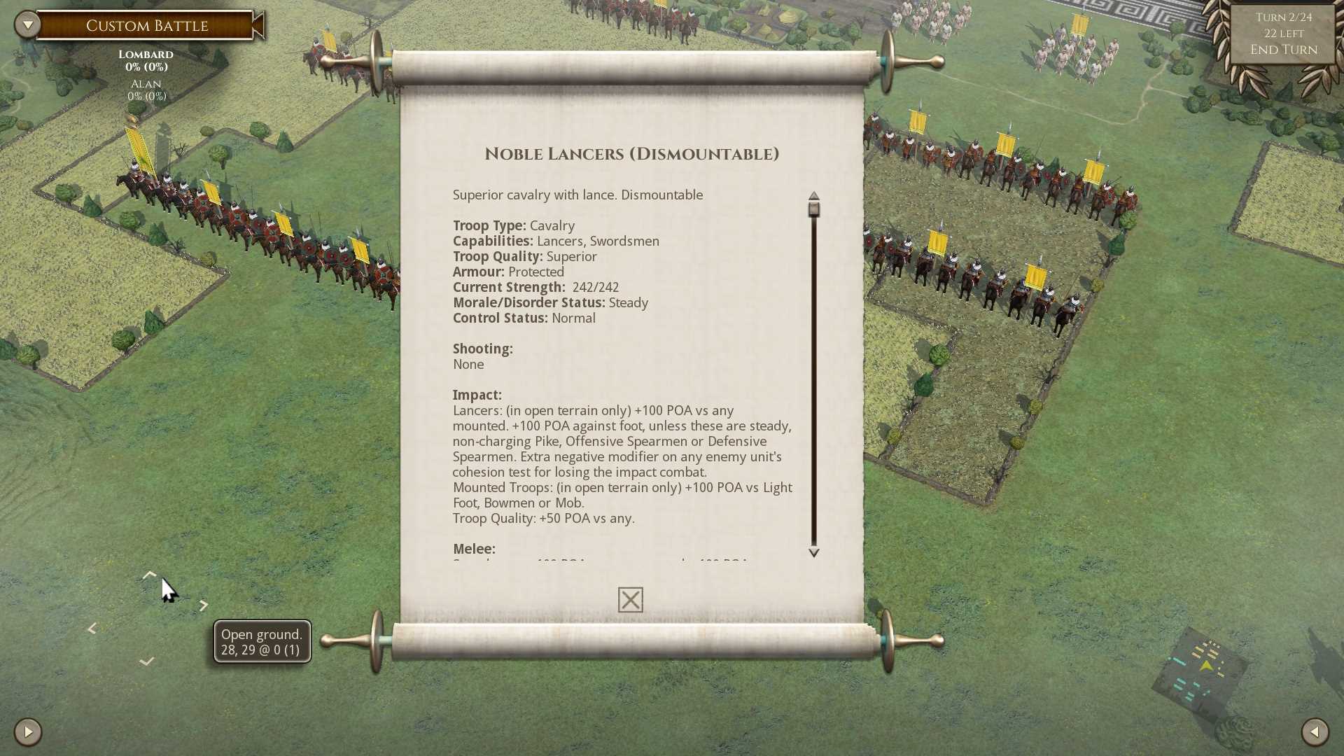
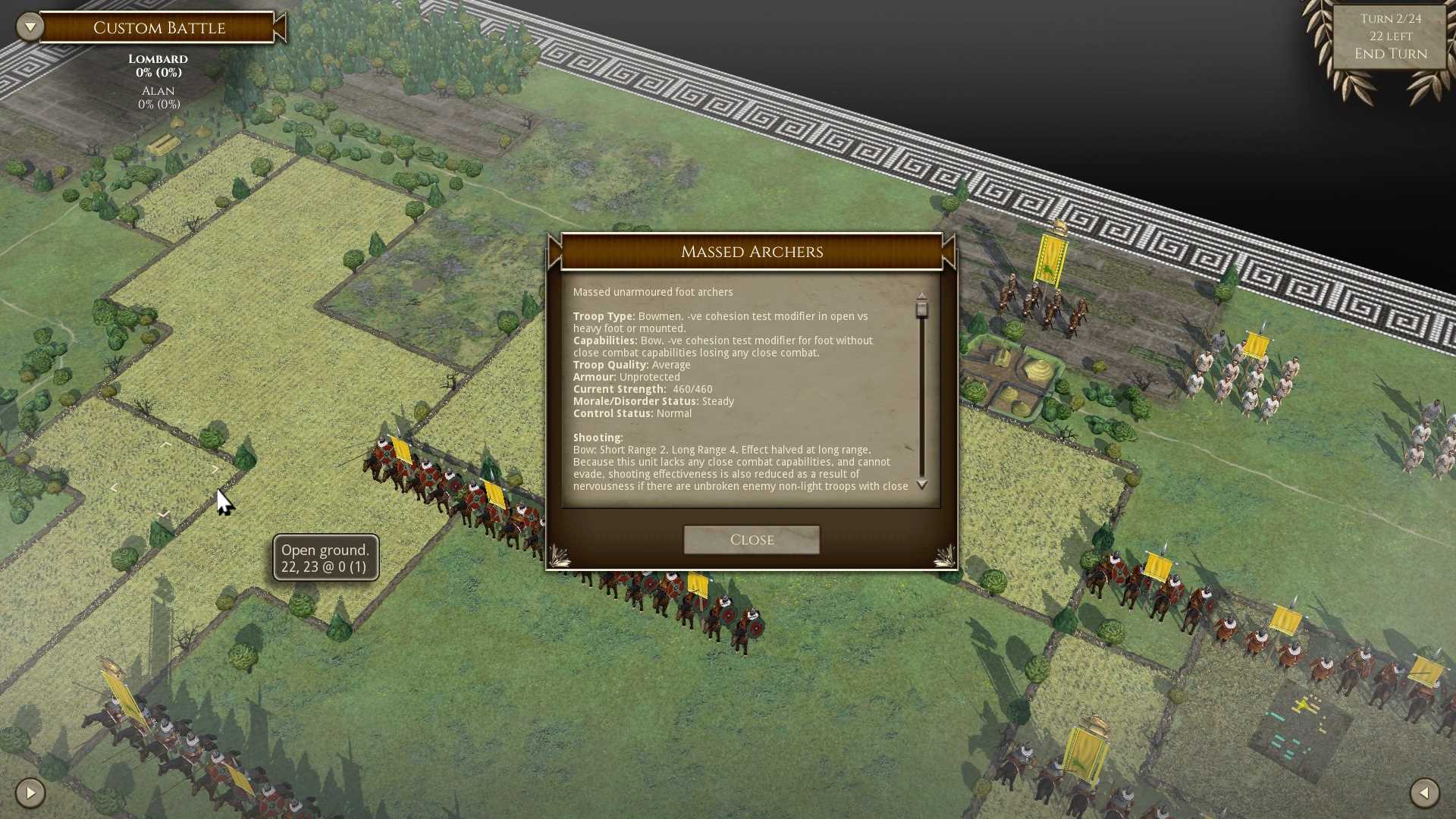
This is about as large as we can go for general purpose use without looking ridiculous. It is 14 point, the same size as the Tooltips. The current in-game font for the Detailed Unit Info is 10 point (see below).
- 14 point version.jpg (211.87 KiB) Viewed 2143 times
- Current.jpg (246.58 KiB) Viewed 2144 times
We are looking into the possibility of adding a large print option which could be used in various places in the UI, but it will only be feasible to do so in parts of the AI where the text is scrolled. In other places there simply isn't room to fit larger text, and there isn't room to expand the base UI objects. It may look like there is spare screen space in some screen resolutions (e.g. 1920 x 1080), but the extra space gets used up in resolutions with a squarer aspect ratio.
Re: Detailed Unit Info
Posted: Fri Nov 09, 2018 9:17 am
by Lebo44
rbodleyscott wrote: Fri Nov 09, 2018 8:00 am
This is about as large as we can go for general purpose use without looking ridiculous. It is 14 point, the same size as the Tooltips. The current in-game font for the Detailed Unit Info is 10 point (see below).
We are looking into the possibility of adding a large print option which could be used in various places in the UI, but it will only be feasible to do so in parts of the AI where the text is scrolled. In other places there simply isn't room to fit larger text, and there isn't room to expand the base UI objects. It may look like there is spare screen space in some screen resolutions (e.g. 1920 x 1080), but the extra space gets used up in resolutions with a squarer aspect ratio.
Is it possible to make the window wider and showing all unit information without the need of scrolling?
Another nice improvement for me would be adding numeric values for troop quality and armor, f.e.:
Troop Quality: Superior (2)
Armour: Protected (1)
Also nice thing that would make analyzing stats easier would be adding colors to Cohesion (Morale), f.e:
Steady (Black)
Disrupted (Yellow)
Fragmented (Red)
Routing (White)
It would be great to implement icons in different colors for each capabilities instead of descriptions to easily distinguish them from the text.
Re: Detailed Unit Info
Posted: Fri Nov 09, 2018 9:59 am
by rbodleyscott
Lebo44 wrote: Fri Nov 09, 2018 9:17 am
rbodleyscott wrote: Fri Nov 09, 2018 8:00 am
This is about as large as we can go for general purpose use without looking ridiculous. It is 14 point, the same size as the Tooltips. The current in-game font for the Detailed Unit Info is 10 point (see below).
We are looking into the possibility of adding a large print option which could be used in various places in the UI, but it will only be feasible to do so in parts of the AI where the text is scrolled. In other places there simply isn't room to fit larger text, and there isn't room to expand the base UI objects. It may look like there is spare screen space in some screen resolutions (e.g. 1920 x 1080), but the extra space gets used up in resolutions with a squarer aspect ratio.
Is it possible to make the window wider and showing all unit information without the need of scrolling?
Another nice improvement for me would be adding numeric values for troop quality and armor, f.e.:
Troop Quality: Superior (2)
Armour: Protected (1)
Also nice thing that would make analyzing stats easier would be adding colors to Cohesion (Morale), f.e:
Steady (Black)
Disrupted (Yellow)
Fragmented (Red)
Routing (White)
It would be great to implement icons in different colors for each capabilities instead of descriptions to easily distinguish them from the text.
Thanks for the suggestions.
Re: Detailed Unit Info
Posted: Fri Nov 09, 2018 2:38 pm
by sIg3b
rbodleyscott wrote: Fri Nov 09, 2018 8:00 am
This is about as large as we can go for general purpose use without looking ridiculous. It is 14 point, the same size as the Tooltips. The current in-game font for the Detailed Unit Info is 10 point (see below).
Current.jpg
14 point version.jpg
We are looking into the possibility of adding a large print option which could be used in various places in the UI, but it will only be feasible to do so in parts of the AI where the text is scrolled. In other places there simply isn't room to fit larger text, and there isn't room to expand the base UI objects. It may look like there is spare screen space in some screen resolutions (e.g. 1920 x 1080), but the extra space gets used up in resolutions with a squarer aspect ratio.
The text in the upper pic is readable for me, but only just. Could you make the colour of the text darker?
Ideal for me would be an option for a still larger font and increasing the width of the box.
Re: Detailed Unit Info
Posted: Fri Nov 09, 2018 3:46 pm
by pipfromslitherine
sIg3b wrote: Thu Nov 08, 2018 8:31 pm
15.5" is pretty much standard for portables; I suppose I am hardly the only person in the world who plays on a Notebook.
But you are probably right that text size for different monitors would require 2-3 manually set options.
I also often work on a 15" laptop with a 1080p display, but then I don't have eyesight issues. The combination is going to be hard to come up with a solution for.
As a test, does the text appear easier to read if you alter the colour balance and contrast (e.g. in Paint etc on the image)?
Cheers
Pip
Re: Detailed Unit Info
Posted: Fri Nov 09, 2018 4:33 pm
by sIg3b
pipfromslitherine wrote: Fri Nov 09, 2018 3:46 pm
sIg3b wrote: Thu Nov 08, 2018 8:31 pm
15.5" is pretty much standard for portables; I suppose I am hardly the only person in the world who plays on a Notebook.
But you are probably right that text size for different monitors would require 2-3 manually set options.
I also often work on a 15" laptop with a 1080p display, but then I don't have eyesight issues. The combination is going to be hard to come up with a solution for.
As a test, does the text appear easier to read if you alter the colour balance and contrast (e.g. in Paint etc on the image)?
Cheers
Pip
I do not really have eyesight issues. Working on my laptop is no Problem at all. Try the *game* on your laptop, then you will see it is really laid out for a large monitor (only).
Basically, only the header in the text is easy to read.
But, sure, it is, to a certain degree, a matter of preference also. Information in the game is presented in an extremely restrained style, while I prefer information to be presented like this:
Re: Detailed Unit Info
Posted: Fri Nov 09, 2018 6:33 pm
by pipfromslitherine
I play the game on the laptop all the time (it would be hard to develop it if I didn't

) but as you say, it is a matter of preference. Other games with larger text and UI are lambasted as "Mobile conversions!!!111!!! Give us a PC UI!!!!" even when there is no mobile version in existence...
It's worth noting that the font file (SYSTEM/FONT.TXT) and the UI layout files (e.g. DATA/UI/UnitInfoPopup.txt) are all editable without affecting gameplay or MP, should you wish to customize the UI to your liking.
Cheers
Pip
Re: Detailed Unit Info
Posted: Sun Nov 11, 2018 7:34 pm
by sIg3b
pipfromslitherine wrote: Fri Nov 09, 2018 6:33 pm
I play the game on the laptop all the time (it would be hard to develop it if I didn't
) but as you say, it is a matter of preference. Other games with larger text and UI are lambasted as "Mobile conversions!!!111!!! Give us a PC UI!!!!" even when there is no mobile version in existence...
It's worth noting that the font file (SYSTEM/FONT.TXT) and the UI layout files (e.g. DATA/UI/UnitInfoPopup.txt) are all editable without affecting gameplay or MP, should you wish to customize the UI to your liking.
Cheers
Pip
I am somewhat sceptical about that possibility. And anyway, I would need a step-by-step instruction of how to do it.
I do not want a larger UI as such, only optional info boxes should be much larger and better readable. Detailed combat reports, tooltips, detailed unit descriptions and all that stuff.