Page 2 of 2
Re: Beta 3 UI colour
Posted: Sun May 19, 2013 10:58 pm
by Rudankort
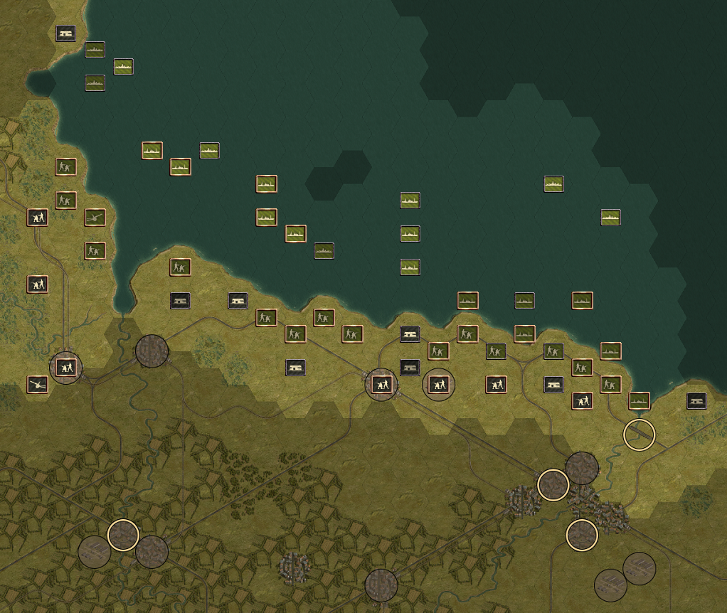
ThvN wrote:Noticed something else. On the strategic map, the Allied icons are green, the Axis are grey. But if you have moved an Allied unit and it has no more actions remaining, the icon on the strategic map turns grey, it looks like it's the icon for when an Axis unit has spent all his actions?
They are dark green actually, but admittedly it is hard to tell dark green from dark gray...
Re: Beta 3 UI colour
Posted: Tue May 21, 2013 6:10 pm
by fsx
Load/save window:
The color at PC fits better to the background color.
The grey used for AC each second line is not so good.
Re: Beta 3 UI colour
Posted: Tue May 21, 2013 10:49 pm
by ThvN
Another UI suggestion: In the 'unit list', minefields are displayed before aircraft. During Cauldron you have to scroll past the many landmines to see your planes in the list, mines and other structures would best be displayed last I guess.
Re: Beta 3 UI colour
Posted: Wed May 22, 2013 10:22 am
by Rudankort
Rudankort wrote:ThvN wrote:Noticed something else. On the strategic map, the Allied icons are green, the Axis are grey. But if you have moved an Allied unit and it has no more actions remaining, the icon on the strategic map turns grey, it looks like it's the icon for when an Axis unit has spent all his actions?
They are dark green actually, but admittedly it is hard to tell dark green from dark gray...
Does this version work better for active/inactive axis/allied units?
- inactive.png (1.57 MiB) Viewed 1188 times
Re: Beta 3 UI colour
Posted: Wed May 22, 2013 6:38 pm
by ThvN
The Allies and Axis icons are certainly easier to keep apart now.
It's difficult to judge the land units (I will photoshop this later for myself to be sure), but the sea units have sufficient contrast. If I'm really being a perfectionist; it might help to have the icon borders get a bit darker when the unit has spent its action.
BTW, did you get the library additions?