Page 1 of 1
[Visual Bug] [Unit stat comparison] [8.4.1]
Posted: Fri May 01, 2020 11:55 am
by GabeKnight
Hovering the mouse over the (same) unit results in a comparison with itself when in purchase/upgrade mode.
Please fix, looks strange; I don't think it was like that before:
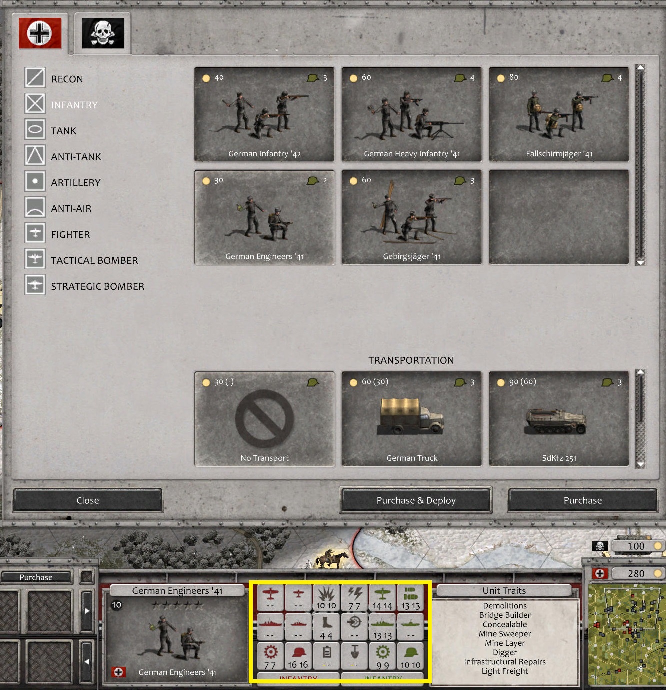
- Screenshot 113.jpg (606.91 KiB) Viewed 1406 times
Re: [Visual Bug] [Unit stat comparison] [8.4.1]
Posted: Fri May 01, 2020 1:15 pm
by Halvralf
Actually it was......
Re: [Visual Bug] [Unit stat comparison] [8.4.1]
Posted: Fri May 01, 2020 1:59 pm
by GabeKnight
Halvralf wrote: Fri May 01, 2020 1:15 pm
Actually it was......
Really? Wasn't sure, but I shouldn't be surprised of such computer-logic.
Then dear Devs, disregard this post or act at your own discretion.
Re: [Visual Bug] [Unit stat comparison] [8.4.1]
Posted: Sat May 02, 2020 7:01 am
by bebro
Like the old joke sez "they are both very similar, especially the one on the left"

Re: [Visual Bug] [Unit stat comparison] [8.4.1]
Posted: Sat May 02, 2020 7:23 am
by GabeKnight
But it's fascinating of sorts (to me), as I don't usually report bullshit. Something about it tipped me off; I was sure that something was different from before...

Re: [Visual Bug] [Unit stat comparison] [8.4.1]
Posted: Sun May 03, 2020 10:29 pm
by Halvralf
Well, whats different now is that when you get upgrade possibility with a unit and click the upgrade button you can't compare the current unit with the upgraded one. That's why you look on same unit in the comparison...
Re: [Visual Bug] [Unit stat comparison] [8.4.1]
Posted: Thu May 21, 2020 10:42 am
by GabeKnight
GabeKnight wrote: Sat May 02, 2020 7:23 am
I was sure that something was different from before...
Found a post in the
steam forum, that may have an explanation:
"[...] However, recent updates have made the fonts smaller as well as moving the comparison stats closer together without any spacing, causing some confusion as single digit stats clumped together to look like one double digit stat. [...]"
And I agree that the numbers shoud be "centered" in their own row and not leaning towards each other. I imagine it to be similar to an Excel sheet and two cells. The numbers can be centered or left/right-aligned (as it is now).