Page 1 of 2
Detailed Unit Info
Posted: Tue Nov 06, 2018 9:56 pm
by sIg3b
I find the info boxes hard to read. I´d like larger type and a larger pic. Is there an option to get a larger info box? Would it help to play with a lower resolution? 1920x1080 is maybe a bit too much with a 15.5" monitor?
Re: Detailed Unit Info
Posted: Wed Nov 07, 2018 8:29 am
by rbodleyscott
There isn't currently a way to enlarge the font without modding the definition of the UI object.
Unfortunately enlarging the UI objects to fit the text on in a larger font would mess up the layout in many cases.
I am not sure whether running in a lower resolution would help - you could try it and see.
Re: Detailed Unit Info
Posted: Wed Nov 07, 2018 3:33 pm
by pipfromslitherine
You could try running in a window with a reduced resolution and then setting the DPI higher for the game, which would scale the window up. Not sure it would look especially great though.
Cheers
Pip
Re: Detailed Unit Info
Posted: Wed Nov 07, 2018 7:11 pm
by sIg3b
The font is really small. White on Light Grey is also not exactly the ideal choice for readability.

I want to read the detailed unit info, but never do so, because it gives me a headache. In my ideal world, there would be a full screen view for each unit type. Some of the really old games got that right.
Re: Detailed Unit Info
Posted: Wed Nov 07, 2018 7:49 pm
by Paul59
sIg3b wrote: Wed Nov 07, 2018 7:11 pm
The font is really small. White on Light Grey is also not exactly the ideal choice for readability.
Exactly which screens do you mean? The only ones that I can recall having white on light grey are the Historical Scenario Selection screens. I can see how some people may have a problem with those, but fortunately my tired old eyes can still cope with them!
Re: Detailed Unit Info
Posted: Wed Nov 07, 2018 8:52 pm
by sIg3b
Paul59 wrote: Wed Nov 07, 2018 7:49 pm
sIg3b wrote: Wed Nov 07, 2018 7:11 pm
The font is really small. White on Light Grey is also not exactly the ideal choice for readability.
Exactly which screens do you mean? The only ones that I can recall having white on light grey are the Historical Scenario Selection screens. I can see how some people may have a problem with those, but fortunately my tired old eyes can still cope with them!
Did you even play the game? All the most important info is White on Light Grey: The Army List where you choose your units, the Detailed Unit Info box, and so on...

Re: Detailed Unit Info
Posted: Wed Nov 07, 2018 9:19 pm
by TimDee58
gosh!
Re: Detailed Unit Info
Posted: Wed Nov 07, 2018 9:48 pm
by sIg3b
This is the one thing I am really missing: A Fog-of-Glorypedia, where I can study and compare the units and army lists, either in-game or as a pdf. All the important info is literally hidden in the small print.

Re: Detailed Unit Info
Posted: Wed Nov 07, 2018 11:54 pm
by Paul59
sIg3b wrote: Wed Nov 07, 2018 8:52 pm
Paul59 wrote: Wed Nov 07, 2018 7:49 pm
sIg3b wrote: Wed Nov 07, 2018 7:11 pm
The font is really small. White on Light Grey is also not exactly the ideal choice for readability.
Exactly which screens do you mean? The only ones that I can recall having white on light grey are the Historical Scenario Selection screens. I can see how some people may have a problem with those, but fortunately my tired old eyes can still cope with them!
Did you even play the game? All the most important info is White on Light Grey: The Army List where you choose your units, the Detailed Unit Info box, and so on...
You know, I was actually agreeing with you, but I wanted to help by clarify exactly what screens you were having problems with, while throwing in a bit of self deprecating humour.
Someone, obviously much wiser than me, said recently that you should never attempt to be humorous in a forum post, it is always misunderstood, he was quite right.
Anyway, I have learned my lesson, I must get back to designing more new scenarios, campaigns and mods.
http://www.slitherine.com/forum/viewtop ... 77&t=80329
Re: Detailed Unit Info
Posted: Thu Nov 08, 2018 12:11 am
by TimDee58
*chuckles* that was a better comeback than I expected Paul
Re: Detailed Unit Info
Posted: Thu Nov 08, 2018 12:53 pm
by rbodleyscott
Something like this would perhaps be clearer? (Dark on light, and a larger font)
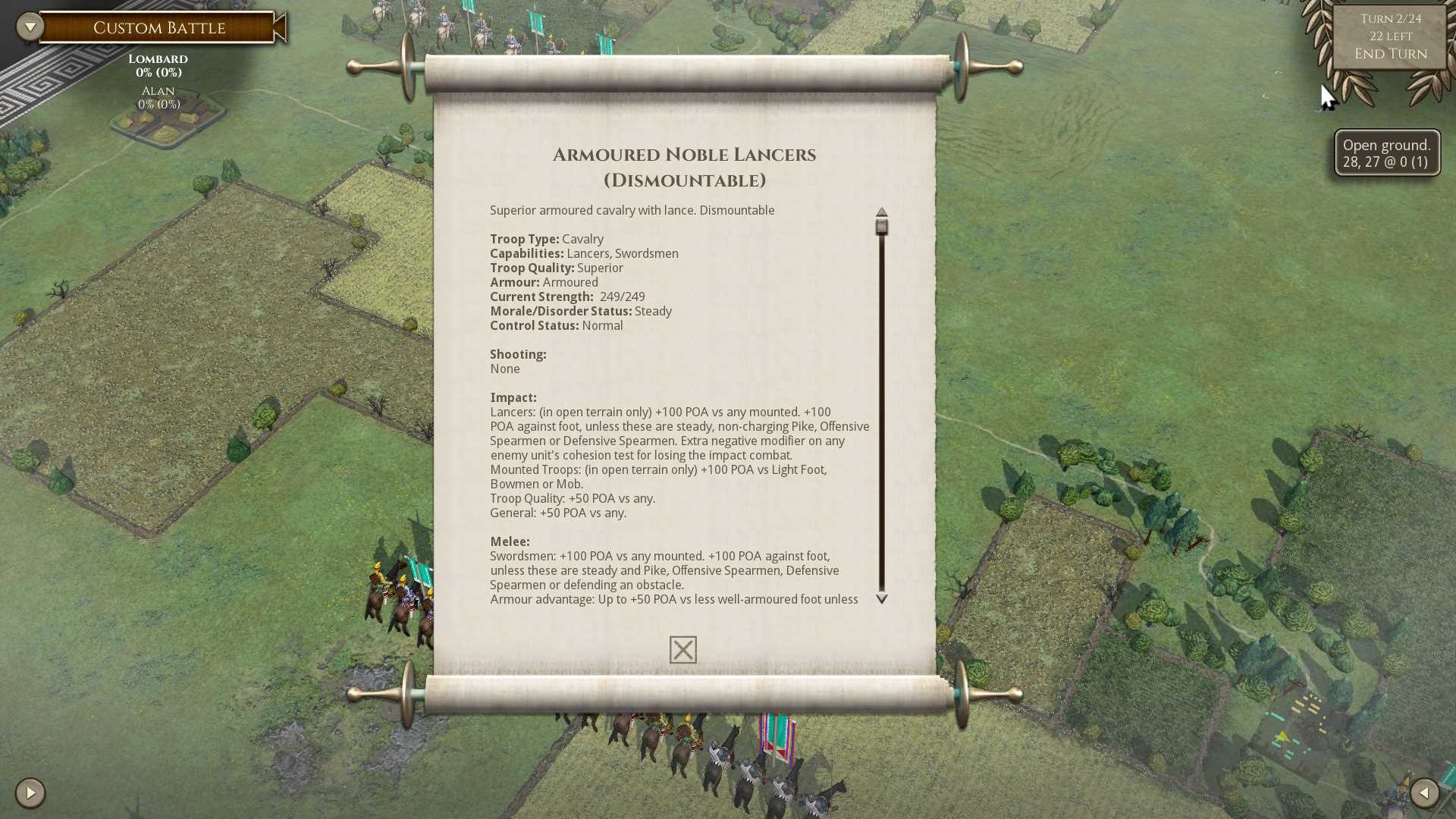
- New Detailed Unit Info.jpg (213.99 KiB) Viewed 3750 times
Re: Detailed Unit Info
Posted: Thu Nov 08, 2018 2:48 pm
by TheGrayMouser
I had no issues with reading the current font scheme, but that looks pretty sharp.
Re: Detailed Unit Info
Posted: Thu Nov 08, 2018 3:13 pm
by MVP7
That looks good. The army selection and unit purchase screens could use some larger fonts and text windows as well.
Speaking of UI, Is it technically possible to add colors and tool-tips to the in-game texts? I have been meaning to do a larger suggestion about the formatting of things like combat log and units info but if the text colors and fonts are heavily limited by the engine that would be pretty pointless.
Re: Detailed Unit Info
Posted: Thu Nov 08, 2018 5:17 pm
by rbodleyscott
MVP7 wrote: Thu Nov 08, 2018 3:13 pm
That looks good. The army selection and unit purchase screens could use some larger fonts and text windows as well.
Speaking of UI, Is it technically possible to add colors and tool-tips to the in-game texts? I have been meaning to do a larger suggestion about the formatting of things like combat log and units info but if the text colors and fonts are heavily limited by the engine that would be pretty pointless.
Colours/formatting can be added fairly easily in the middle of text.
AFAIK there is no way to add tooltips to words in text, each such item would need its own UI object.
Re: Detailed Unit Info
Posted: Thu Nov 08, 2018 6:29 pm
by sIg3b
Paul59 wrote: Wed Nov 07, 2018 11:54 pm
You know, I was actually agreeing with you, but I wanted to help by clarify exactly what screens you were having problems with, while throwing in a bit of self deprecating humour.
Someone, obviously much wiser than me, said recently that you should never attempt to be humorous in a forum post, it is always misunderstood, he was quite right.
Thanks for clearing that up. Occasionally I get humour, but no guarantees.

Re: Detailed Unit Info
Posted: Thu Nov 08, 2018 6:38 pm
by sIg3b
rbodleyscott wrote: Thu Nov 08, 2018 12:53 pm
Something like this would perhaps be clearer? (Dark on light, and a larger font)
New Detailed Unit Info.jpg
Only the heading is a comfortable read.
How about something like this:
Re: Detailed Unit Info
Posted: Thu Nov 08, 2018 6:55 pm
by sIg3b
To clarify: Letters 1.5 - 2x the size of your example and all bold would be fine.
Re: Detailed Unit Info
Posted: Thu Nov 08, 2018 7:16 pm
by MVP7
sIg3b wrote: Thu Nov 08, 2018 6:55 pm
To clarify: Letters 1.5 - 2x the size of your example and all bold would be fine.
What kind of screen are you using? That's way too large font at least on a 24 inch 1080p screen and very uncomfortable to read for me.
Would it be possible to have an option for small, medium and large font to cater for different screen DPIs and eyesights?
Re: Detailed Unit Info
Posted: Thu Nov 08, 2018 7:40 pm
by sIg3b
15.5 Inch/1920x1080p.
And yes, the text in the boxes should definitely be adjusted to screen size, not smaller on a smaller screen. I think that´s the problem.
Re: Detailed Unit Info
Posted: Thu Nov 08, 2018 7:49 pm
by MVP7
sIg3b wrote: Thu Nov 08, 2018 7:40 pm
15.5 Inch/1920x1080p.
And yes, the text in the boxes should definitely be adjusted to screen size, not smaller on a smaller screen. I think that´s the problem.
Is that 15.5 width or diagonal? I don't think the game can figure out screen size itself so it would require a manual option.