Page 1 of 2
Weather info
Posted: Sat May 21, 2011 10:49 pm
by Obsolete
It seems the weather icons in this version make it even harder to tell the difference between clear and cloudy than the last one.
Anyhow, I mentioned earlier you may want to also add some kind of back-drop between turns so it's rather hard to miss when the weather changes:

Posted: Sat May 21, 2011 11:38 pm
by Panzer3L
Good point.
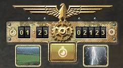
I also find the two round current-weather and weather-forecast windows not so good.
I have to hover the mouse over them in order to get the info,just from looking at the grafics i can't tell what is what.
So here's an idea.
Make them not round but square and a bit bigger so people can quickly change these small pictures themself.
Pacific General had some small animation for those weather windows,nothing big,just a 15frames gif or so would do fine.
In case an animation would cost too much grafic performance ,a switch to turn them of would be cool.
Posted: Sun May 22, 2011 12:06 am
by Rudankort
We may still do turn splashes showing weather, but in any case, ingame indication is also needed. So could you guys explain what exactly is the problem?
The icons we have now:


Isn't there enough difference? Rain and snow are made animated to attract attention to bad weather, I think they look quite different. Sun and cloud are also hard to confuse - the colors are very different.
Of course the modders are free to insert any images and animated gifs there (everything is ready for that), from PacGen or elsewhere, but we cannot use graphics from there ourselves, so we need to make good stock icons. Any suggestions how to improve them are welcome.
Posted: Sun May 22, 2011 12:28 am
by Razz1
Actually they are 1000% improved, but they still need to have a larger icon.
Posted: Sun May 22, 2011 12:39 am
by Acererak
Adding a tooltip with each weather type gameplay effect wouldn´t hurt either.
Posted: Sun May 22, 2011 8:08 am
by Obsolete
Rudan, the first two images are almost impossible to tell the difference from on my system.
Posted: Wed May 25, 2011 10:44 am
by tnourie
How about adding a little airplane pic to the sunny weather window? This would make it immediatly different from the clouds icon, and imply air attacks are unimpeaded.
Posted: Wed May 25, 2011 11:36 am
by IainMcNeil
Posted: Wed May 25, 2011 1:44 pm
by Razz1
Isn't frozen a separate condition?
Why not get rid of the tool tips and just have words under the icons?
Sun, Clear
Cloudy
Snowing
Snowing, Frozen
Cold, Frozen
Rain, solid ground
Rain, Muddy
Muddy, Clear
Re: Weather info
Posted: Wed May 25, 2011 2:14 pm
by heinrich
Obsolete wrote:It seems the weather icons in this version make it even harder to tell the difference between clear and cloudy than the last one.
Anyhow, I mentioned earlier you may want to also add some kind of back-drop between turns so it's rather hard to miss when the weather changes:
I like the idea. We would get a useful info with the stat screen at the beginning of a new round and you are absolutely right. We would never miss again bad weather conditions

and it would be a nice benefit to the atmosphere!
Posted: Wed May 25, 2011 10:05 pm
by Kerensky
This problem will also be partially solved by allowing the player to reference the relevant text information at will.
An option to allow the player to recall a window that says, in plain text:
Current weather and ground conditions.
Scenario briefing, objectives, and time limits, if applicable.
Weather Icons
Posted: Wed May 25, 2011 10:58 pm
by bobk
Why not make them rectangular, matching the size of the counters just above. With the bigger size, and the animation, I think that would do nicely.
Posted: Thu May 26, 2011 1:48 am
by OmegaMan1
I think the current icons are pretty good, but also pretty small. I still like the idea of the current/future weather coming up as a pop-up when you pass the cursor over it.
Posted: Thu May 26, 2011 1:49 am
by OmegaMan1
All very clear!
I like the size of those icons, Ian, I vote we go with those. Now, where to put them on the screen...

Posted: Thu May 26, 2011 9:15 am
by IainMcNeil
Obviously they are nopt to scale!
I was assuming they would be much bigger

Posted: Thu May 26, 2011 12:15 pm
by Obsolete
Well, on my large screen sizes I find the icons very small indeed.
Also, I've now looked at the icons on another computer, with different monitor etc, and it's still not obvious from first sight at the first two icons if it is sunny or cloudy. They are far too similar. This is not good GUI design. Just like, the current way of telling the difference between an aux and a core unit is very hard to tell apart as well.
Posted: Thu May 26, 2011 1:10 pm
by OmegaMan1
Just like, the current way of telling the difference between an aux and a core unit is very hard to tell apart as well.
I 100% agree with this statement... telling core vs. aux units apart is a little better in the latest beta, but is still a very difficult thing for me to readily see. I really, really hope this gets addressed before the game goes to final release.
Posted: Thu May 26, 2011 2:50 pm
by Obsolete
By the way, in case anyone gets the wrong conclusions here, I am in full favour of using icons to represent the weather. I believe this is on the right track. I have plenty other older wargames which use text for almost everything, and this does not make for a modern GUI. I often find myself slowed down trying to read EVERYTHING instead of simply taking a quick look at visuals.
Humans are visual in nature, it is much quicker to respond to icons (images) than having to process text. The only task is to make these easy to distinguish at a glance.
Posted: Thu May 26, 2011 3:01 pm
by Jmcmenamin
Rudankort wrote:We may still do turn splashes showing weather, but in any case, ingame indication is also needed. So could you guys explain what exactly is the problem?
The icons we have now:
Isn't there enough difference? Rain and snow are made animated to attract attention to bad weather, I think they look quite different. Sun and cloud are also hard to confuse - the colors are very different.
Of course the modders are free to insert any images and animated gifs there (everything is ready for that), from PacGen or elsewhere, but we cannot use graphics from there ourselves, so we need to make good stock icons. Any suggestions how to improve them are welcome.
They look too alike to me. Bigger would be better making them look less alike even better.
Posted: Thu May 26, 2011 3:43 pm
by Obsolete
I think a big problem here, is that different monitors are calibrated differently.


