Page 1 of 2
Painting Help
Posted: Sun Dec 13, 2009 4:13 am
by nickj
So I just picked up my first two army starter packs, however, I've only painted 40k so I'm looking for some help. I have the Milanese and Burgundian starters from Old Glory. I have considered having someone paint them, but I'd probably hate myself in the morning.
However, fantasy is "easier" in that there is no "right" way to paint something. Are there good picks on the web for these two armies that I should be looking at as guides?
I'm planning on black primer with block coloring and ink washes.
Posted: Sun Dec 13, 2009 12:27 pm
by will05
There is always the Osprey books, and often some things will come up if you google images. I usually find out a bit and then go with a degree of artistic licence for a good aesthetic look. After all I like the colour of ancients and medieval.
Posted: Sun Dec 13, 2009 6:01 pm
by Skullzgrinda
You can save yourself some steps with a white primer and thick washes in 15mm. That is sometimes sufficient to finish the area without a subsequent ink wash. It won't work on a black primer coat however.
Posted: Sun Dec 13, 2009 6:08 pm
by nickj
Is there an example of the technique on line? The majority of posts I've looked at have suggested black primer.
Posted: Sun Dec 13, 2009 7:03 pm
by Skullzgrinda
nickj wrote:Is there an example of the technique on line? The majority of posts I've looked at have suggested black primer.
Not that I am aware of. If I were not a tech neanderthal I would post some of mine. What happens is that the wash of acrylic leaves a heavier deposit in sculpted recesses, and only a thin coat on the high areas. With the white undercoat the high areas are lighter and brighter, while the low areas have an opaque coat of paint. This works well for everything except lighter reds, which require a base coat of a yellow or light orange before the desired red is applied.
The black primer technique is all about coverage and opacity. More labor intensive and somber looking IMO.
A white primer technique relies on translucence and capitalizing on the sculptor's labor. The result often has fewer steps and produces a brighter product. One guy said my minis looked like porcelain. Whether that is a good thing or not is a matter of tastes, of course.
Some surfaces require multiple coats. Flesh, horses and metals, and most leather. Cloth can often be done in one go however.
I tend to use the black primer for 28mm minis, but the white for 20mm and smaller. The brightness helps the smaller minis IMO.
Posted: Sun Dec 13, 2009 8:40 pm
by lawrenceg
Skullzgrinda wrote:nickj wrote:Is there an example of the technique on line? The majority of posts I've looked at have suggested black primer.
Not that I am aware of. If I were not a tech neanderthal I would post some of mine. What happens is that the wash of acrylic leaves a heavier deposit in sculpted recesses, and only a thin coat on the high areas. With the white undercoat the high areas are lighter and brighter, while the low areas have an opaque coat of paint. This works well for everything except lighter reds, which require a base coat of a yellow or light orange before the desired red is applied.
Some surfaces require multiple coats. Flesh, horses and metals, and most leather. Cloth can often be done in one go however.
I use white primer and here is the result (on 15 mm).

I find it works well for horses. Spray white, grey or sand and slop on the darker colour.
For metal you have to paint a solid dark colour and dry brush the metallic after varnishing. For bronze I use a brown undercoat and drybrush with artists acrylic gold. For gold and siver I use enamel metallics.
Posted: Sun Dec 13, 2009 11:15 pm
by madaxeman
White or black makes no real difference to an ink technique - one ends up lighter, that's all. Black is IMO generally better for medievals due to the amount or armour - and they should look grubbier too!
Most ancients painters "make up" the colours, with maybe some very basic googling research or copying others ideas! Noone will beat you up as long as common sense is used in picking colours. Only a few care enough to do ultra research, but they are a small minority, and often there is no "right answer" anyway.
Posted: Sun Dec 13, 2009 11:33 pm
by ethan
Keep in mind that ancients were somewhat limited in terms of colors they had available.
Posted: Mon Dec 14, 2009 1:19 am
by ottomanmjm
For colours and colour combinations you can always do a web search for Medieval Heraldry to get some ideas.
Posted: Mon Dec 14, 2009 2:00 am
by Skullzgrinda
lawrenceg wrote:
I use white primer and here is the result (on 15 mm).
I find it works well for horses. Spray white, grey or sand and slop on the darker colour.
For metal you have to paint a solid dark colour and dry brush the metallic after varnishing. For bronze I use a brown undercoat and drybrush with artists acrylic gold. For gold and siver I use enamel metallics.
An excellent example. And about 85% of the figure is done with a single coat on the primer.
Posted: Mon Dec 14, 2009 2:05 am
by Skullzgrinda
madaxeman wrote:White or black makes no real difference to an ink technique - one ends up lighter, that's all. Black is IMO generally better for medievals due to the amount or armour - and they should look grubbier too!
True, but a good wash technique achieves in a single coat what would otherwise require two steps of block painting followed by the ink wash.
A wash will fail on a black primer coat however.
Posted: Mon Dec 14, 2009 10:32 am
by madaxeman
Skullzgrinda wrote:madaxeman wrote:White or black makes no real difference to an ink technique - one ends up lighter, that's all. Black is IMO generally better for medievals due to the amount or armour - and they should look grubbier too!
True, but a good wash technique achieves in a single coat what would otherwise require two steps of block painting followed by the ink wash.
A wash will fail on a black primer coat however.
True, I've used washes and even inks direct on white undercoat before, but do find them a bit too "clean" for my medievals nowadays. Then again, I most often go for a brown ink wash over everything,
like this! 
Posted: Mon Dec 14, 2009 11:37 pm
by Skullzgrinda
madaxeman wrote: True, I've used washes and even inks direct on white undercoat before, but do find them a bit too "clean" for my medievals nowadays. Then again, I most often go for a brown ink wash over everything,
like this!
I confess that I paint my 15mm figures a bit prissy and bright so that they will pop up visually - the opposite of what happens to objects seen in the distance, as the micro-armor folk will go on about at length. I noticed the brown ink washed minis on your site earlier, and have to say they are very impressive. I usually see dipped minis which are overdone and look like salvage from a spitoon. Those, on the other hand, are quite nice indeed.
Since I last played it seems that painting standards in general have improved quite a bit. Oddly, terrain is poorer, and almost abstract.
Posted: Tue Dec 15, 2009 12:46 am
by Strategos69
You can get quick and great results with a little research and some different painting techniques. basicly, the difference between painting fantasy and "historical" is that fantasy painture sets are much brighter than things in real life. In fact fantasy ressembles more like commercials, bright and attractive, whereas when painting ancients and medieval people tend to get more realistic results. Here you have a discussion about dipping techniques and how they work
viewtopic.php?t=7329&postdays=0&postorder=asc&start=20
Also a video about how you can apply it
http://www.youtube.com/watch?v=iYfhmfFg ... r_embedded
But in my opinion I would rather recommend you using bitumen of judea (not pure, but dilouted!). You will get some results that will ressemble more like something "old". Here you have some results:


I would also use white primer if your miniatures are primarily coloured and black one if they have mostly metal armour. I will try to take a few pictures of my French knights and post them around
Posted: Tue Dec 15, 2009 12:48 am
by Strategos69
Ok, here you have those examples. I used white coat but I reprimed with black the armour parts, That way it was easier to paint the horses.

Posted: Tue Dec 15, 2009 8:06 am
by will05
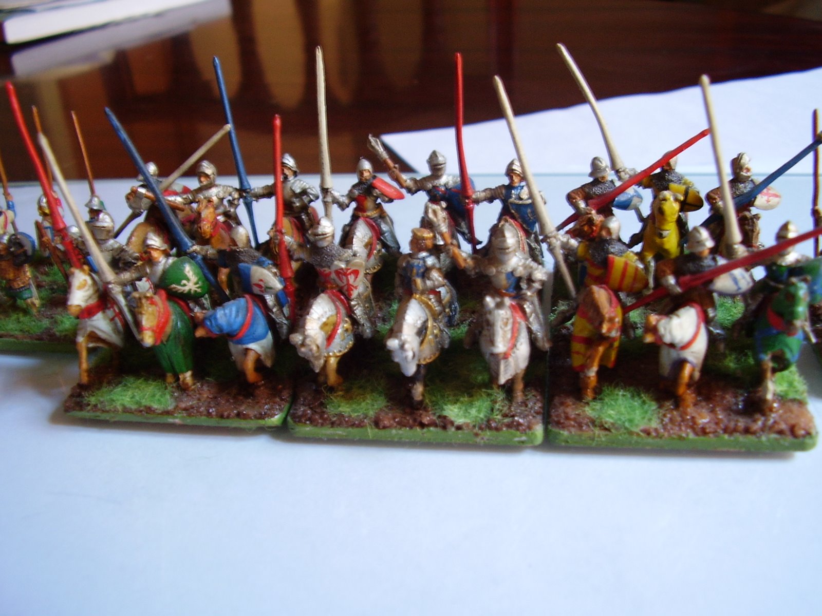
i use a black primer for 15mm and I think that it gives a sharper result. Colours are good as well. I use white and wash on some 28mm stuff.
Some pics are here. All are black primed.
http://littlearmies.pbworks.com/
Posted: Tue Dec 15, 2009 1:33 pm
by BrigPaul
Quality work will05, very impressive. I'm a black primer as well.
Posted: Tue Dec 15, 2009 4:19 pm
by expendablecinc
I undercoat in chocolate brown. Black is ok but I am very picky with my own stuff and I dont like the overstated contrast for most troops (plate armour excepted).
http://expendablecic.tripod.com/seleucid/index.htm
http://picasaweb.google.com.au/expendab ... 0539643794
Anthony
Posted: Tue Dec 15, 2009 4:33 pm
by Skullzgrinda
So, nickj . . .
Did all of this help answer your question?

On color schemes, just check out some of the basics on rules of heraldry, some period art work or guides such as the Osprey books, and simulate them is my advice. I would only make command stands historically specific, and otherwise keep the troops generally accurate, but not specifically anyone's colors or heraldry. This keeps tham a bit more morphable into other contemporary armies, and prevents civil wars between units on opposite sides in identical heraldry.
Get stuck in on some castings or units you care less about, and allow yourself to experiment and perhas make mistakes. 15mm is far easier to paint than 25mm.
Posted: Tue Dec 15, 2009 6:57 pm
by mellis1644
Skullzgrinda wrote:So, nickj . . .
Get stuck in on some castings or units you care less about, and allow yourself to experiment and perhas make mistakes. 15mm is far easier to paint than 25mm.
Black or white undercoat is a matter of taste and style as much as anything else. I've tried both and prefer black myself.
But to the reason for the post, which is that although I'm not a great painter but I'm sure I agree with your last comment. 15mm's can survive poorer paint jobs and be 'table worthy' IMO. So I agree the 'acceptable to the gamer' standard for 15mm wargame paint jobs from the 2 foot range is lower than on a 25mm.
However, if you want to have really nice paint job for close inspection, I'd say that is just as hard to do a good 15mm as a 25mm figures. I personally find that my time spent painting 15mm painting definitely has made doing larger figs easier. The preciseness and control needed for 15mm means the larger scales feel easier to paint. Highlighting, blending and shading in 25+mm is easier than on a 15mm.
However, I'm sure others may have different as I'm not the greatest painter. But like everything else in the painting side of things, different people like, are happy with and experience difficultly with different aspects.
I do echo the comment of check the web/osprey or other books etc for some inspiration just have a go.